Autodesk Tinkercad redesign
I was the first Tinkercad designer and growth hacker post-acquisition by Autodesk, and helped to grow Tinkercad via iterative design, testing and content creation from just 50k users to well over 13 million (55M+ now) – a 25,900% increase (in three years). This is the story of Tinkercad.
On their hands Autodesk has – what I believe to be – is THE concept of the easiest and most enjoyable browser app in the world (not to mention most useful, too!).
Website redesign
Tinkercad is a community wrapped around an app. While the app needed little improvement in the visual department, the website, on the other hand, had to be completely redesigned. Here's why:
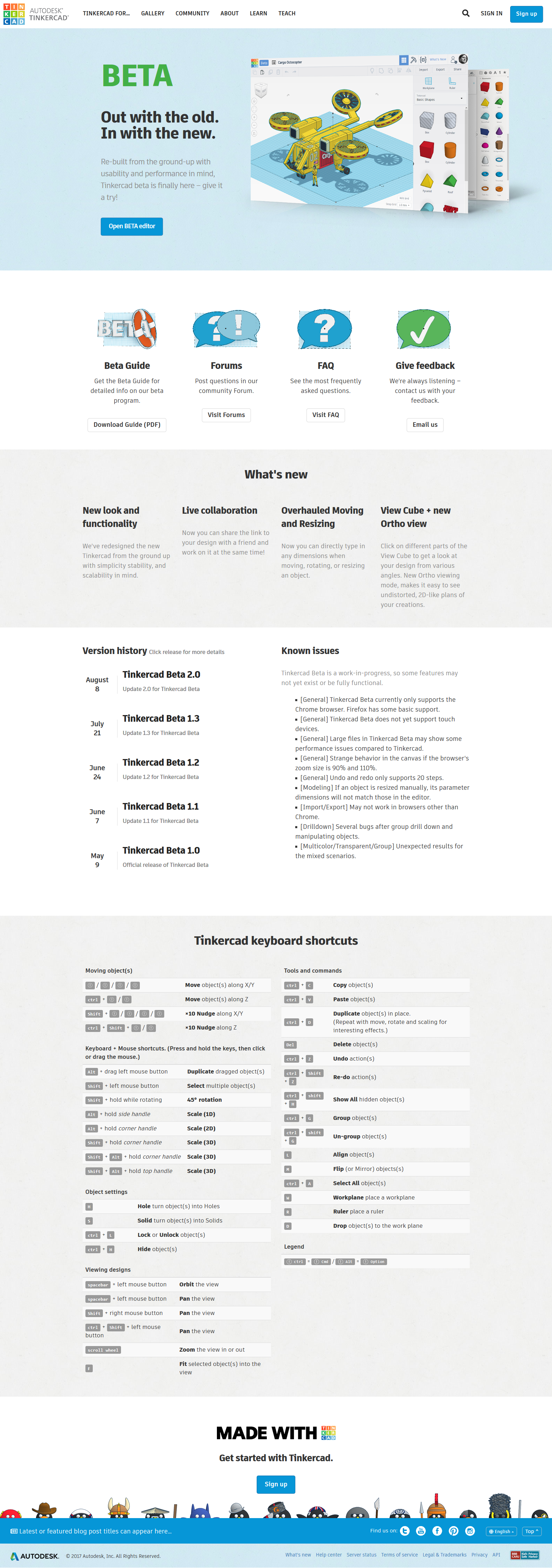
BETA
V1
V2

V3.2
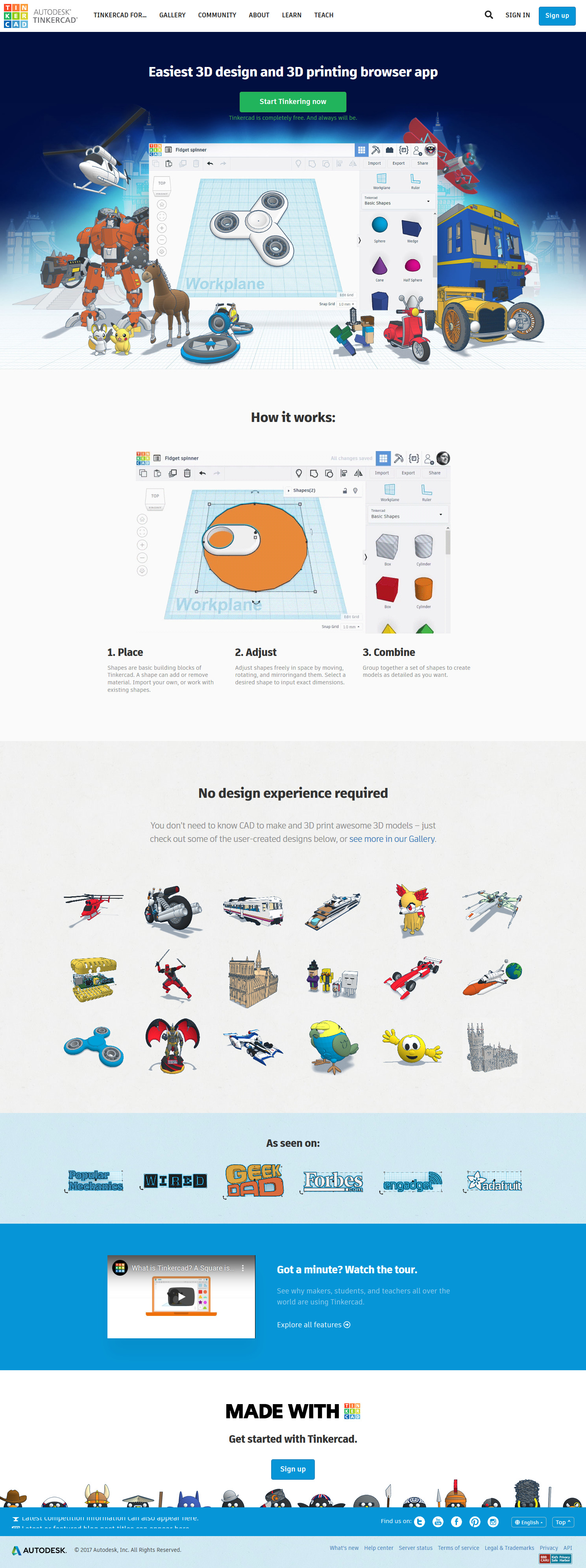
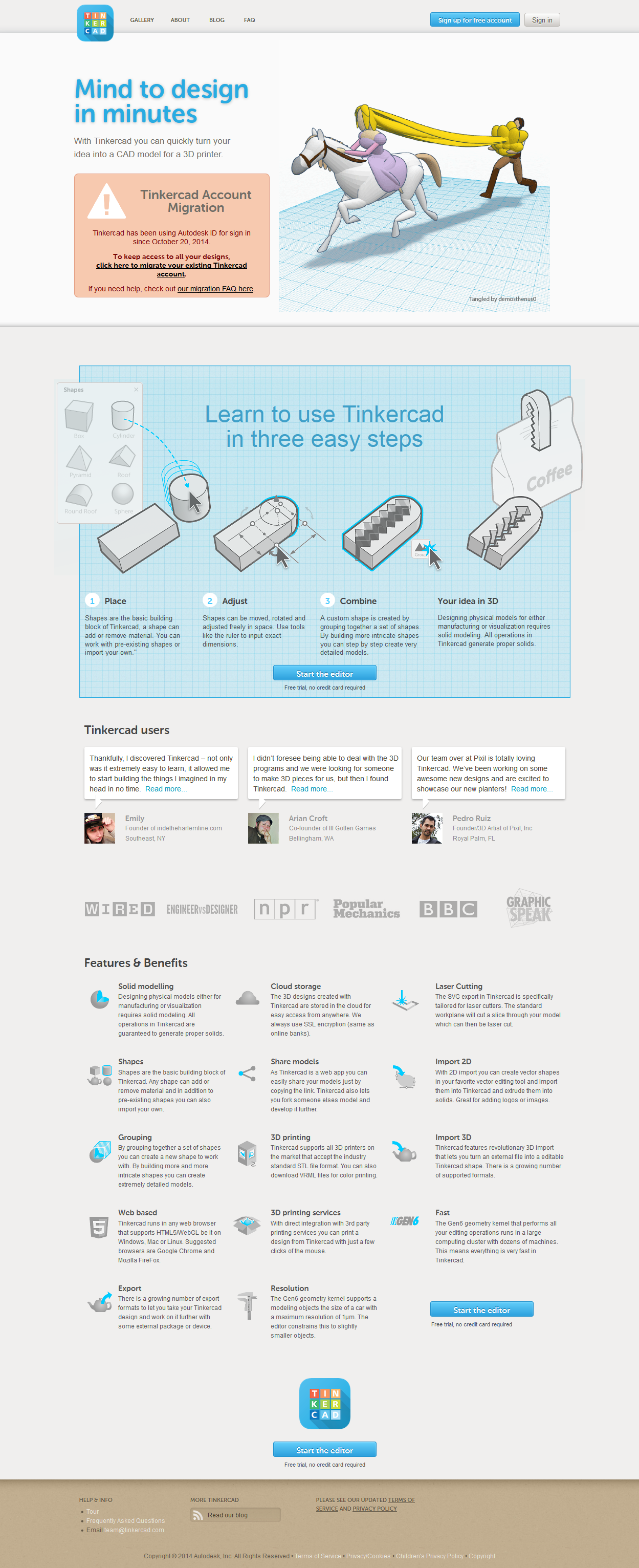
Pattern is quite obvious here: move away from feature-based marketing and towards benefit-based marketing has proven (in this and every case) to more than double the conversion rate. Simplify the language. Get more graphical. (Marketing 101, really…)
Key Visuals/Marketing
All of the designers and marketers that came before and after me (besides whoever created the BETA index page), for some reason always tried to invent creative ways to represent the app, without realizing that the app markets itself.
In this case you really do have to ‘know your audience’.
…And I'm not talking about setting up user groups to try and figure out a bunch of good-for-nothing, common-sense-type of information. The entire team should be comprised of hardcore 'makers', who [ab]use the app on daily basis… People who dream it! Not the ones with no ideas who hire other, ‘no-idea’ people.
Get out of your comfort zone, and do the world a favor – find your own niche; something you can't live without. And then go and improve that thing. But not this one.
It is the single most recognizable app in the world. THE WORLD, people! OK? It doesn't need to be degraded to other graphical means of representation outside of app's existing design! …If only said people used the app and their creativity to create in-app presentation art.
In other words: create all the graphics in Tinkercad, and arrange them in Photoshop. Case closed!
Main banner
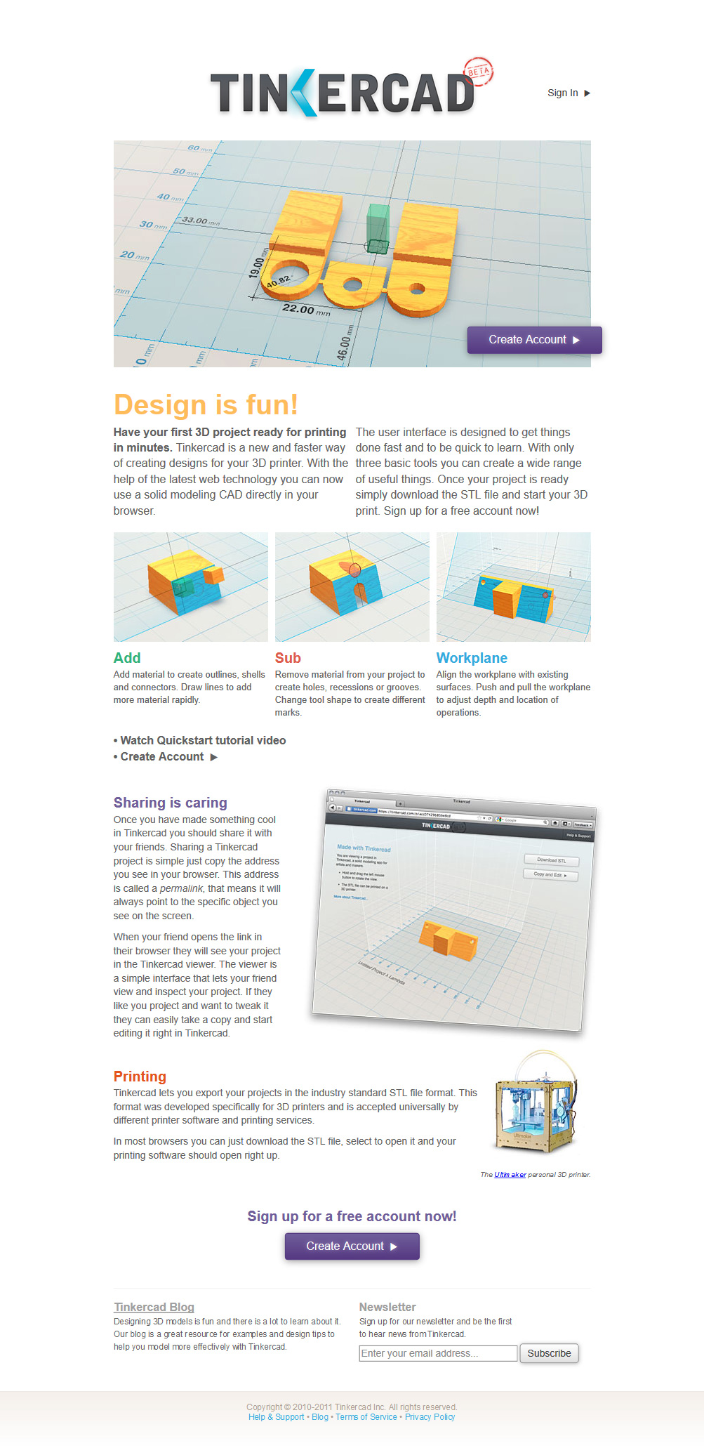
Below is what I started with. Upon initial examination, the top contains all the required conversion elements: heading, sub-heading, main CTA, video, and a visual:
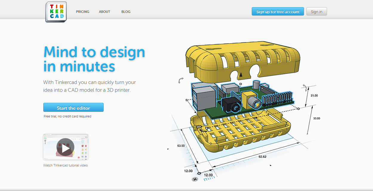
Although this isn't THE first version of Tinkercad, I'm considering it as such since this was the starting point post-acquisition.
The issue with the initial design laid in specialization.
What everyone – including the current leadership – fails to understand is, as a Oscar Wilde once noted, “to define is to limit”. As soon as you start going through exercises which help you determine who your target audience is, you are doomed from the very beginning.
In this case, the banner was too specific for the “target audience” of the entire world. (Because anyone can use Tinkercad, as long as they know what a computer is; and if you are designing for one group, you are missing all the others.)
BETA
Working alongside the best Design Manager and User Experience Architect I've come across in my entire career in the Bay, Amy Phillips, we've outlined the visual direction of what would become V2 of the website:
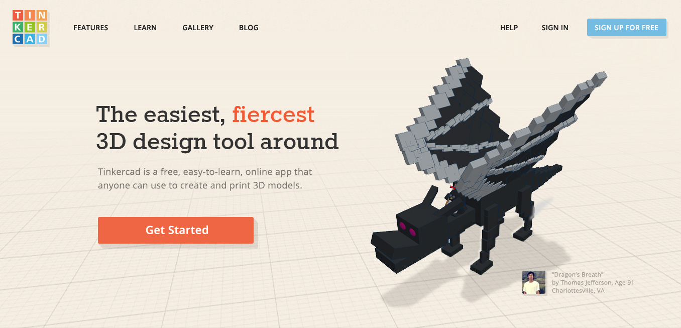
ALPHA of Amy's proposed design.
- To remove ambiguity, we ditched the complexity of dimensions on the featured 3D design and have opted to use something people could connect with (vs electronic device enclosure, which, I'm not going to lie, was one of my favorite Tinkercad graphics of all time).
- To eliminate the ‘sterile feel’, and to add a visual anchor to the top of the website, Amy has incorporated a bit of background color into the banner.
- I suggested for the copy to be updated to include some popular keywords for SEO purposes.
- Finally, the main CTA was drastically increased in its prominence – this eventually resulted in higher conversion rate. One thing to note about CTA colors: they are all derived from the logo (that we have also redesigned), to closer tie things to the brand…
V2 – BETA, refined
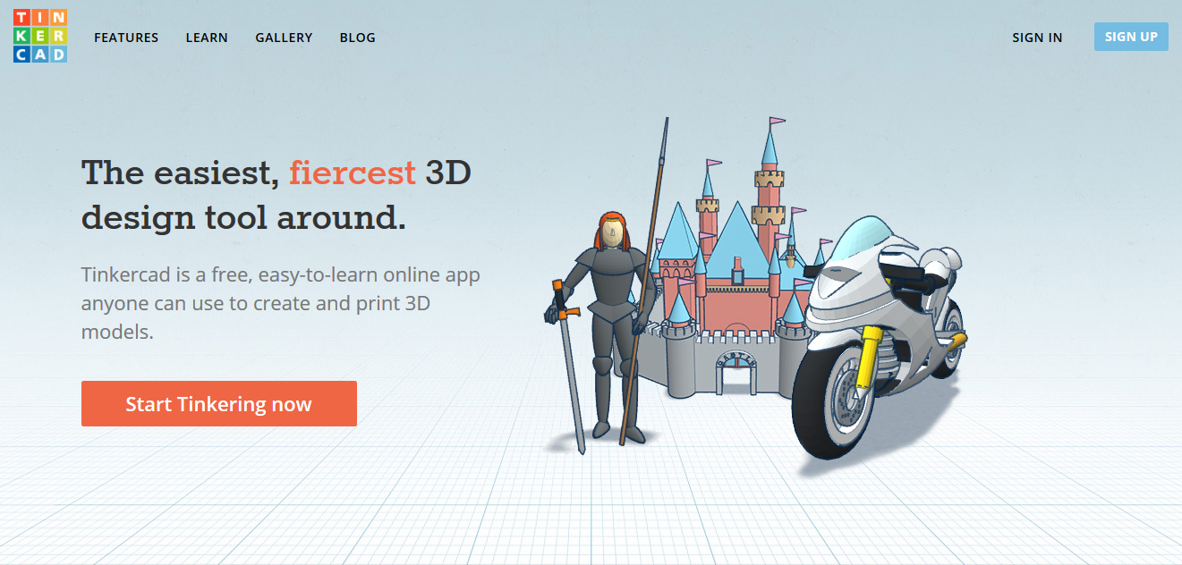
V2. Further refinement of Amy's proposed BETA, by yours truly.
- Certain things cannot be explained; they are simply truths. The color/tone was one of such things. Warm tones were never meant to be present in Tinkercad, so I've ‘gone cold’ and the team has never looked back since.
- To further improve on Amy's design, and to appeal to a wider audience, I have incorporated more than just a single 3D design.
V2.1 – design via A/B testing
At this point we had a nice framework to experiment with, and so for the next little while this is exactly what I did:
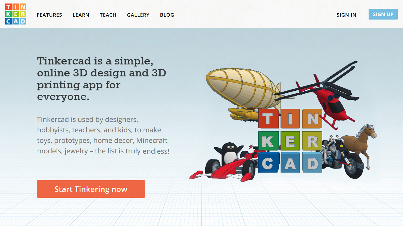
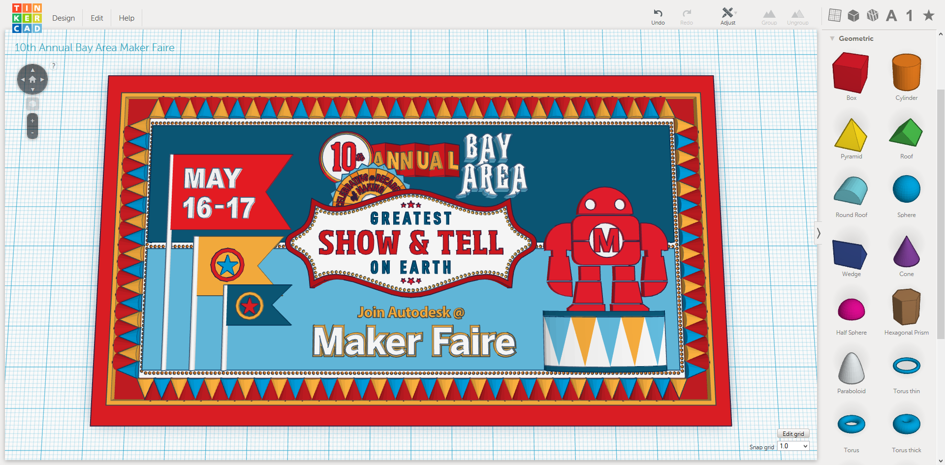
- Upon further examination and feedback I've expanded the main graphic to cover an even wider audience. This graphic has lived on for several years, and proved to be instrumental in offline promotion of Tinkercad as well (was even used as a 10×10 tradeshow booth display background).
- I'm all about organic [SEO]. If we can achieve growth without spending money, I will first exercise that option. I also happen to love to write… The updated-by-me copy not only answered more of users' questions and therefore increased the conversion rate, but also had a great impact on organic growth of the product thanks to the integration of popular key phrases such as “3D design”, “3D printing”, and others.
Current state of affairs
Before I get to “what Tinkercad should have been…”, here's yet another great example of over specialization – this time in its current design:
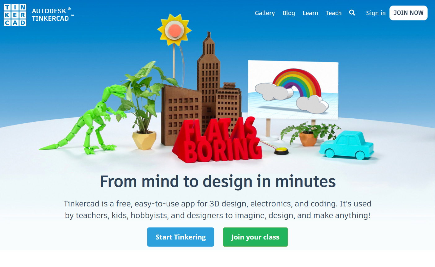
Brand/Design direction: Hens Teeth; Scene Design + Photography: Instructables (internal design team). Key concept "flat is boring" (with flat cardboard buildings in the back – was this an intentional pun?) was born as the involved parties figured that all the promotional graphics that I created using Tinkercad itself, were "flat". Up until then I did not know that you can have a "flat" 3D design… And "boring" is what you see above.
Taking direction from Hens Teeth – a branding agency that seemed to have hired a junior contract graphic designer to re-imagine an online app, internal Autodesk marketing team has once more embarked on a journey of re-imagining Tinkercad brand (there have been several previously failed attempts at redesigning the website by equally incompetent agencies of preference (how do they find these guys?)).
Here's where the problem was: marketing department did exactly what I told them NOT to do. They have gone ahead and spent many months and many hundreds of thousands of dollars to "determine" that their audience mostly consists of kids (duuuh!), so they have redesigned the website with that in mind…
Everything about this redesign screams “a toy for kids” – completely dismissing all (semi)professional users. If the goal was to have less users, then they have certainly accomplished that, as last time I checked this design was driving at least a 15-20% decrease in conversion.
The redesign was obviously full of good intentions. The team wanted to show users that you can take a digital design and turn it physical, however there were several crucial things wrong with this scene to begin with:
- As mentioned before, it is only targeting a very specific audience: schools and kids. This might be their biggest audience, but now this will be their only audience.
- This doesn't tell the story they wish to tell, as the story doesn't have a beginning. Beginning in this case would be the app itself, and it is nowhere to be found!
- Elements selling the app are not enticing enough – to say the least. A dinosaur and a childish car are quite rudimentary, and the the [flat] cardboard city has absolutely nothing to do with 3D and the app itself. They could have at least used a 3D printed city… These elements just didn't provide enough spark for human curiosity to transform into a successful conversion.
- Connection to electronics is a non-obvious one, and is therefore meaningless. Pressing the yellow button for the sun to “light up” is not something that will signal “Hej! This app also does electronics – you should register!”
- I always feared that their slogan “from mind to design in minutes” wasn't immediately understood by all (it took me a while to clue in what it is they were talking about at first), which is one of the reasons why it was retired in the previous version. They have decided to bring it back; this forced them to remove important-to-their-organic-SEO-efforts keywords which drove a big chunk of organic traffic. A hint to parties involved: Tinkercad brand is not as much verbal (slogans/words) as it is visual (logo/colors) in its nature.
- The only item with faint ties to the app now is the billboard; and let's be honest here – would you register so you could build rainbows? I highly doubt it…
Now, onto…
What Tinkercad should have been…

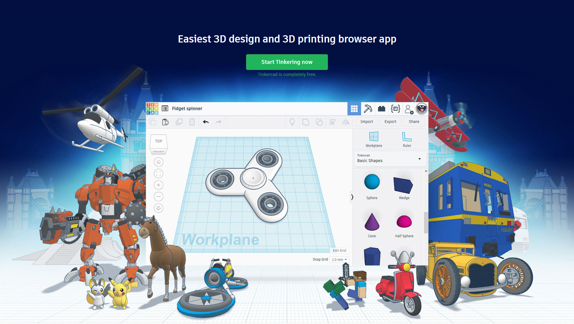
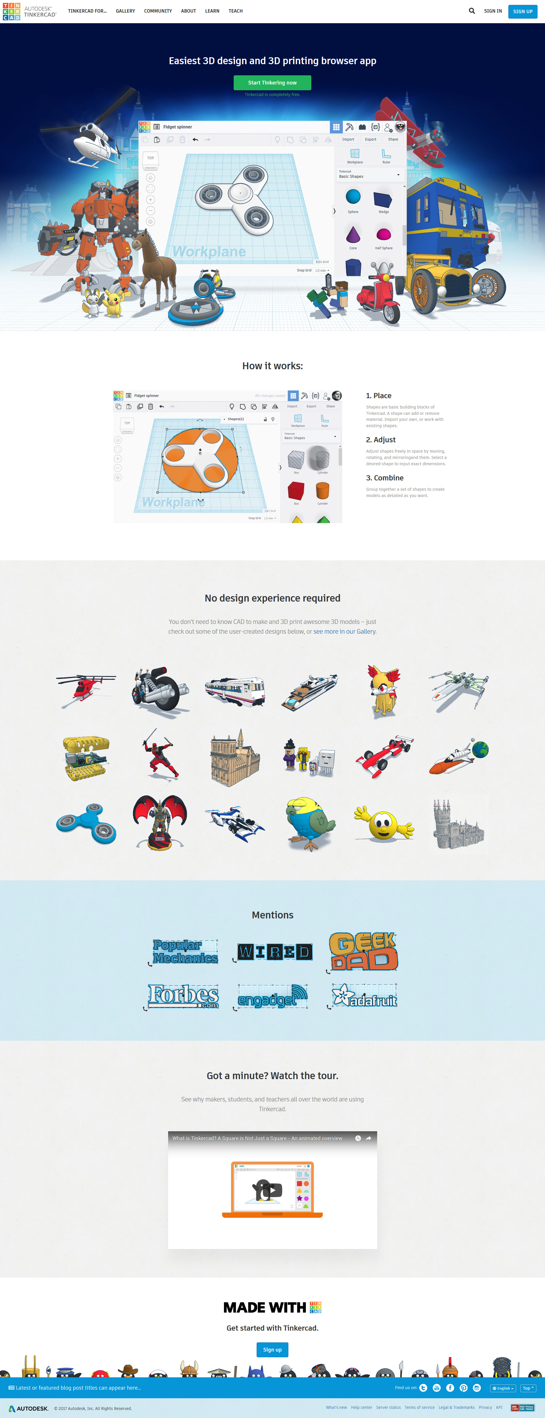
- This design represents all of the research and findings, which dictate what users are interested in seeing: less words, and more graphics [created using the app itself].
- The most obvious difference (aside from graphics) is the information architecture. I immediately tell the user what it is, give them an option to use it, and re-affirm their choice via “Tinkercad is completely free.” confidence statement/booster. Unlike the proposed deign by Hen's Teeth, most important information is kept above the fold – on every screen size.
- To deepen connection with existing community, I designed the banner using community-created 3D designs from all over the world. I have taken it upon myself to contact users for permission, and to let them know about the project.
- Special care went into arrangement and selection of said designs as they had to appeal to a wide audience. This is one of those pictures that “says a thousand words”…
- The idea was to show the user what they are getting right away without any “sugar coating” – in this case that would be the app itself, what its capabilities are, and, to keep things “fresh”, the featured project within the app screenshot could be updated to something trending AND it could also be made animated, too…


How it works…
Herein lays another issue: misrepresentation.
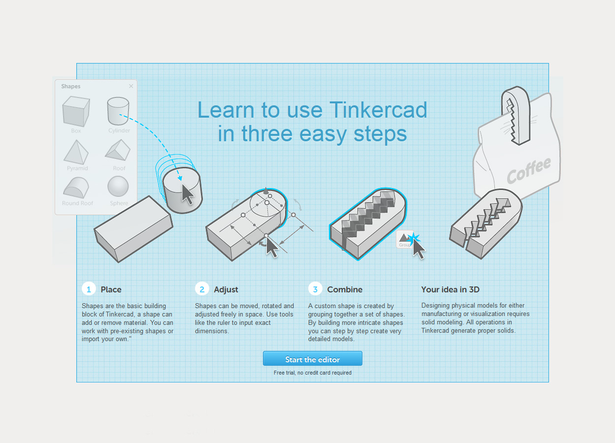
At first glance, this looks like a very cool graphic! Let's take a closer look:
- People DO NOT READ – especially in case of Tinkercad. They are here first of all because of how simple it is to use the application and four paragraphs is unfortunately four paragraphs too much…
- Learn in THREE easy steps, yet this block features FOUR columns. This creates confusion.
- Connection to the product must be a lot more meaningful, yet the only thing that connects these ideas to the app itself is the blue workplane grid.
- Not intuitive, not descriptive (how did we go from step 2, to step 3?)… You are forced to read. But I don't WANT to read!
- Language in the fourth column isn’t for novice users – who happen to be the target audience. They do not understand concepts behind 3D design and 3D production, YET.
How can we better explain what Tinkercad is without saying a single word? The answer is quite simple: animation. And we're not talking about a regular screen video recording, which is how the team used to promote the app…
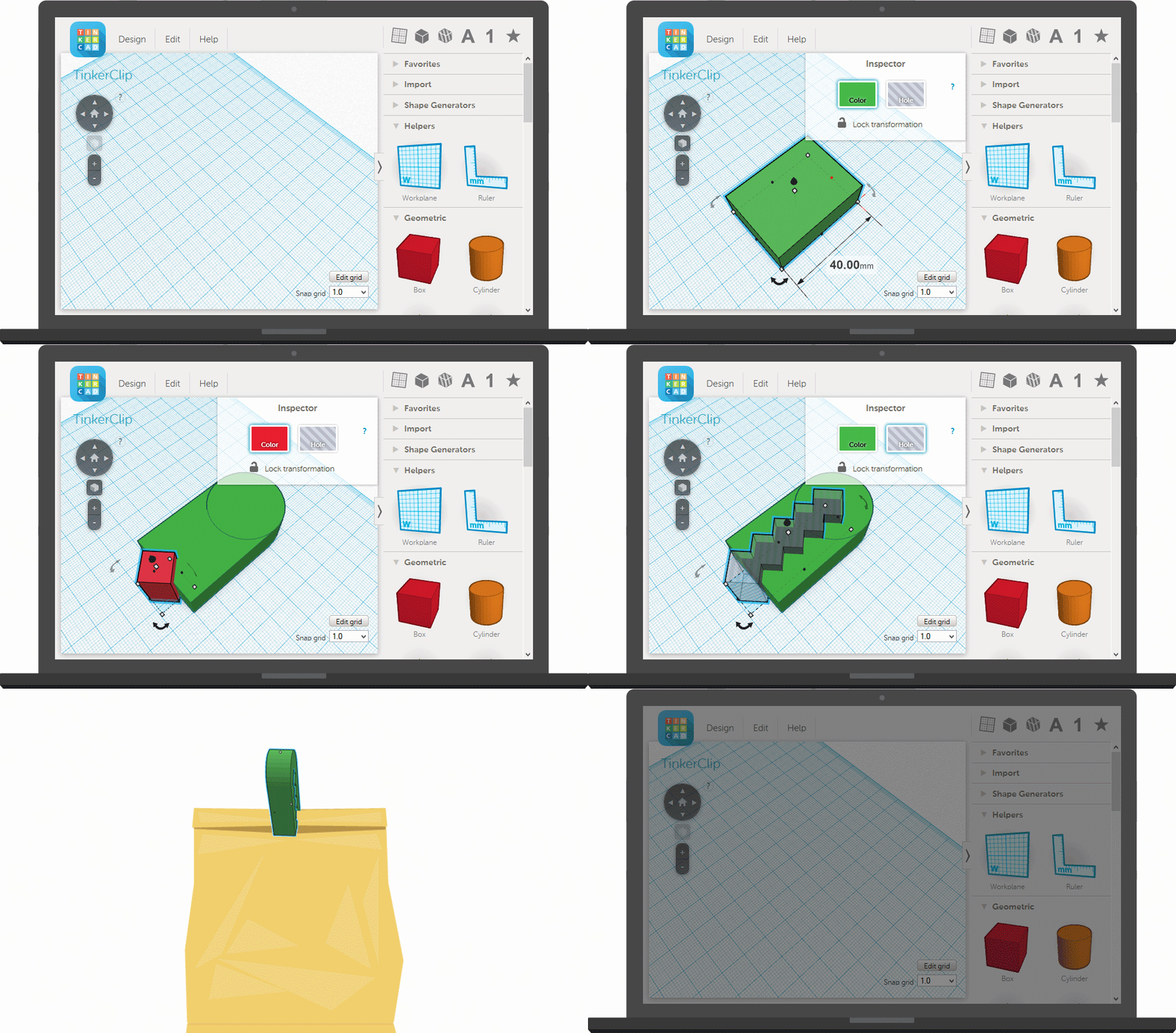
Sticking to Tinkercad's brand, these animations are made to mimic the scrappy maker approach – they are not supposed to look “professional”, or too refined – just the right amount of polish.
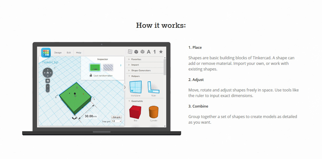
- Even at first glance, this design already looks much less convoluted than the previous one.
- I've combed through the language for each one of steps in order to simplify it and to make it easier to read.
- “Learn to use Tinkercad in three easy steps” vs “How it works:”. Users are not here to learn; they are here to DO, and so all they need to know is how it works. Nothing more. This is a very slight, but important distinction, and one which contributed to a higher conversion rate.
- As mentioned before, the reason for the success of this particular section's redesign isn't because of “moving pictures”, it's because of the way these pictures move. You see, anyone can do a screen recording, but not everyone would be willing to build this animation frame-by-frame, purposefully, and thoughtfully – which is exactly what I did. This allowed me to omit unimportant/minor steps, while telling a more complete story and at the same time keeping the user engaged throughout the entire animation, which, again, was purposefully made short (under 15 seconds each).
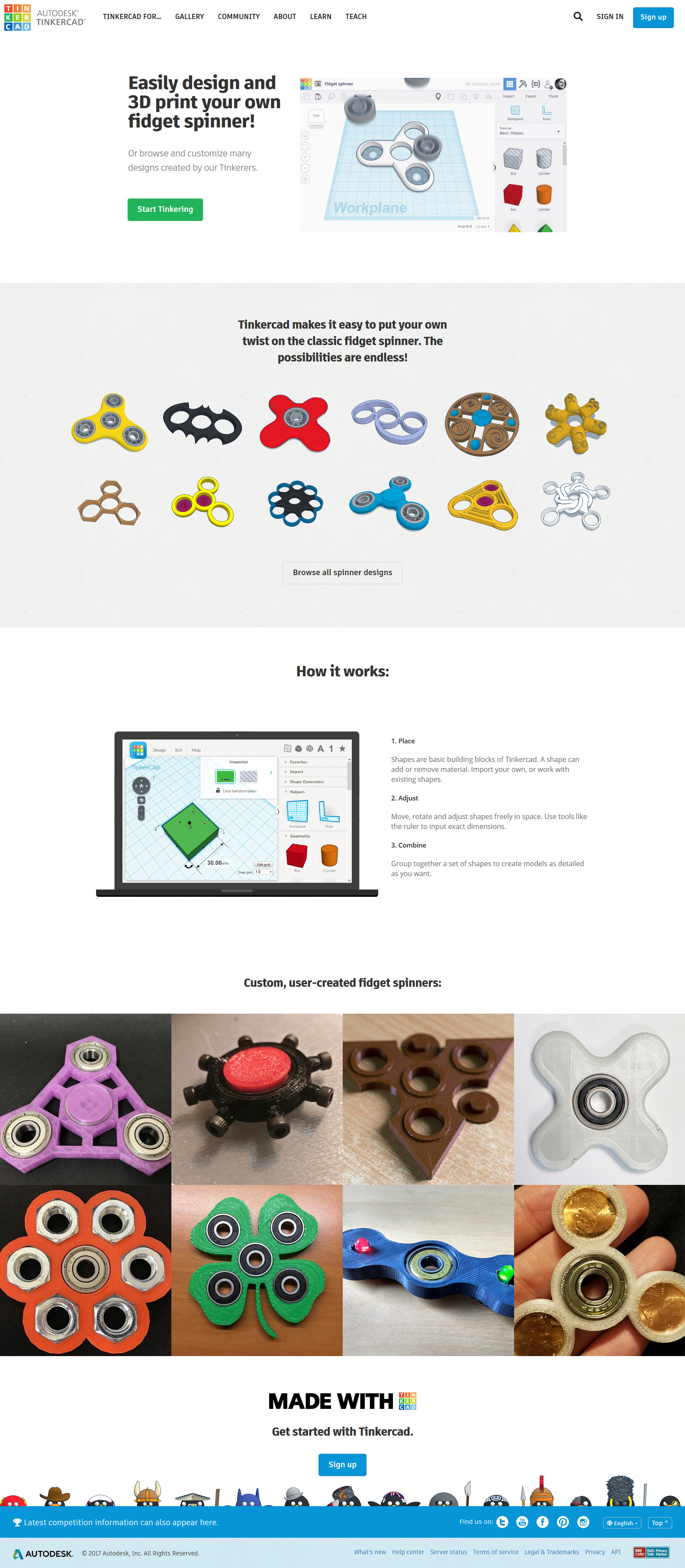
- These short animations were SUCH a big conversion driver, that Autodesk's marketing department decided to include this type of content on every major landing page, in most cases tailoring the content featured in animation to that of the landing page. Here's an example of one of such landing pages:

Custom-built – frame-by-frame – animation of “Fidget Spinner creation process”. I put it together using After Effects and Photoshop.
Maya Thomas was instrumental in research and compilation of all the content, as well as the overall structure and flow of the page. As a result our marketing spend decreased, and our conversion rate increased. Magic.
User-created content
There is a very specific trend you will notice in the evolution of Tinkercad's main graphic design. With each iteration, design got more and more graphic-heavy…


My intention with this initial graphic was to “sell the user on-the-spot” – first of all without them having to do any more discovery via scrolling, and second of all, certainly without having to go off the page to "seek more answers". As a result, the graphic had to not only appeal to everyone, it had to, at the same time, sell the app itself, as well as its capabilities – 3-in-1 so to speak.
User-generated content showcase section was meant to serve as a "safety net" for anyone who would "fall further through the page". It was meant to tell users a bigger story and at the same time allow for their mind to run wild with ideas – so they could imagine themselves creating something of their own for that is the deciding factor in successful conversion.
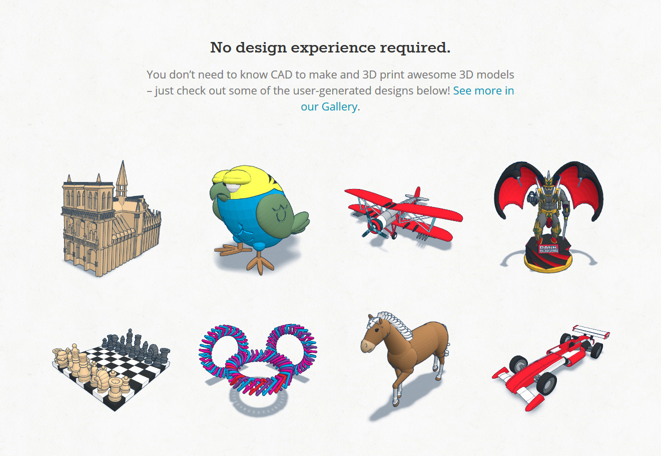

Addition of this section alone was responsible for a big spike in conversion rate as none of the previous tinkercad websites sold the app via its creations – which is just a no-brainer!
Onboarding
COPPA
I was put in charge of designing out the entire experience end-to-end. In case you're a fan of Silicon Valley, you might have heard the abbreviation before… COPPA stands for Children’s Online Privacy Protection Act; and yes, it's a real thing.
It states that if you collect data from anyone under the age of 13, you MUST have their parental consent. In case you have no such consent, you can be fined at the federal level anywhere between $15,000-$45,000 for every underage user in your community…
…Even if you were to take a small chunk of Tinkercad's 20M userbase, let's say 1M (it's a lot more than that), then you begin to see the bigger picture:
1,000,000×$15,000=$15,000,000,000.
This will mean that in the best case scenario, you'd be paying 15 Billion (yes, that's a capital B), in the worst, about 315B… And these guys are not kidding around – Google (YouTube) already got fined $170M for its violations.
Knowledge is power, and thankfully Autodesk always has great insights [ahead of time], given you know where to look. As a result, even before COPPA was a “thing” online, our team already had all the t's crossed, and i's dotted in this department.
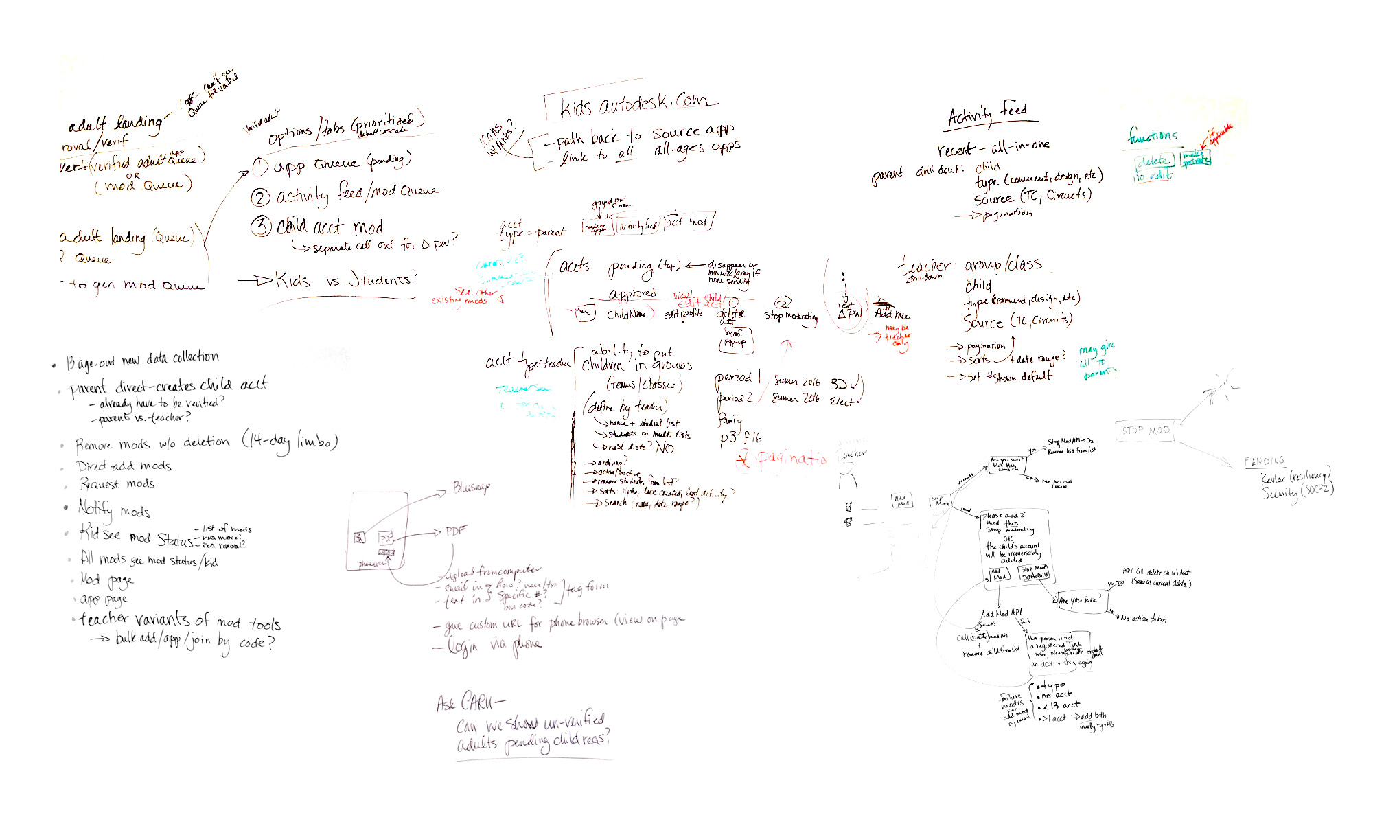
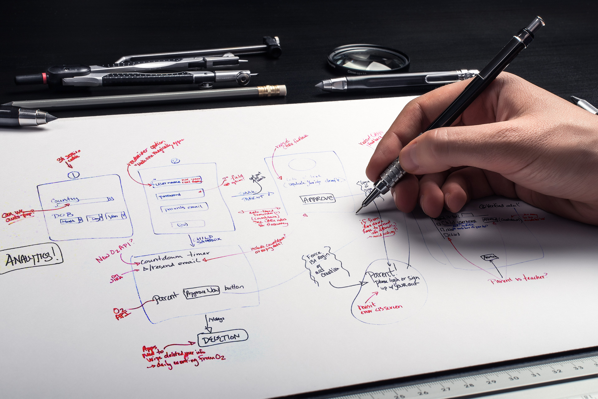
…To reinstate the complexity of this workflow one more time, and because you wouldn't believe that I had “thought through/designed” this otherwise (welcome to Bay area), I'll include another set of super complex scribbles that you will not understand. After seeing this, surely you will believe me…
Serving as Autodesk's ambassador for this project, I had a real pleasure of working with Christy Canida (wife/partner in-crime of Instructables founder, Eric Wilhelm). She was the link between Autodesk's legal and product teams and CARU (Children's Advertising Review Unit) ensuring compliance along every step of the way. Together we've brainstormed majority of the work before making all the findings available to the rest of the team. Any more “cooks in the kitchen”, and the process would have been extended greatly…
Working with a preexisting convoluted flow that didn't meet COPPA's requirements, we set out to simplify the work not only for the end-user, but also for internal teams who were involved in approvals of parental consent applications. …And not that we needed to see where users were struggling – it wasn't that difficult to tell – but a lot of effort was put into finding out exactly that.
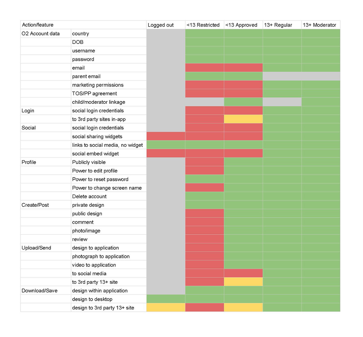
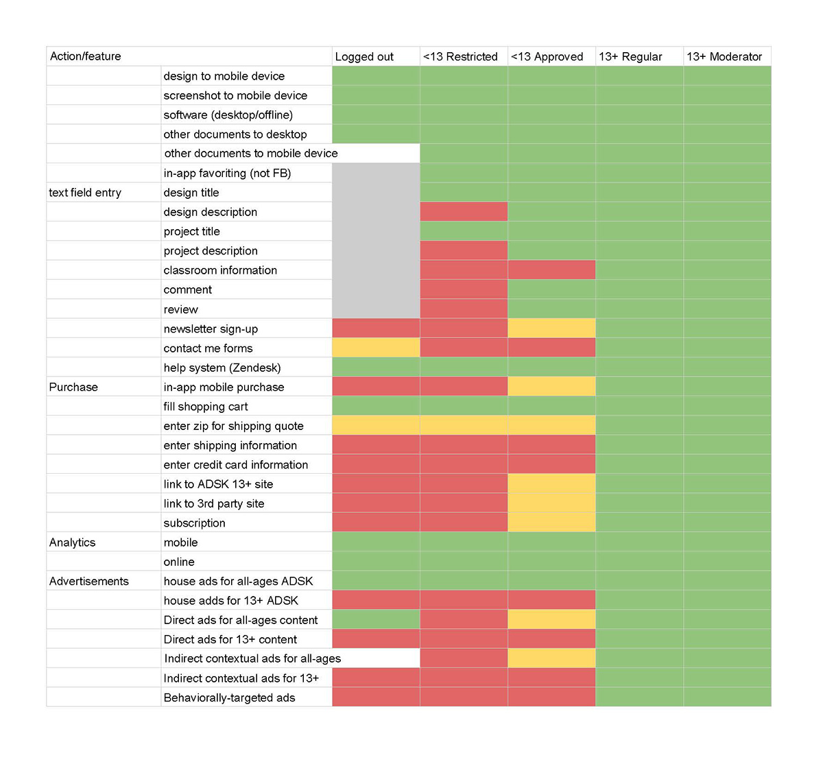
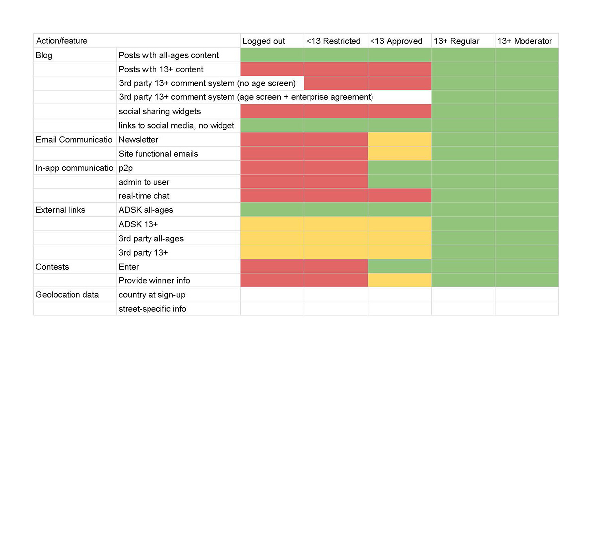
Checklist: scoping the affected by COPPA features of the community.
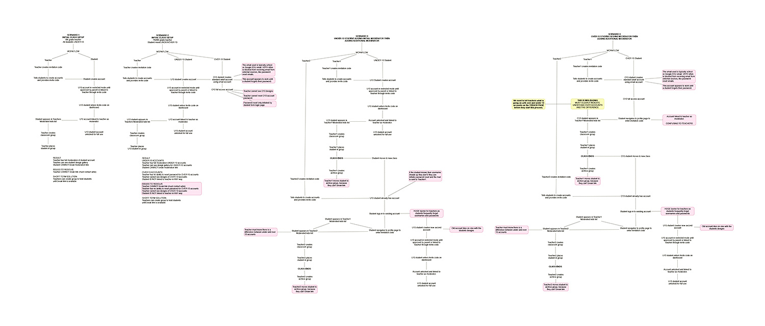
A huge chunk of time was spent on moderation workflows with Education Lead, John Helfen. Together we brainstormed all the possible ways things can go wrong…, and as you can see, combinations were plentiful.
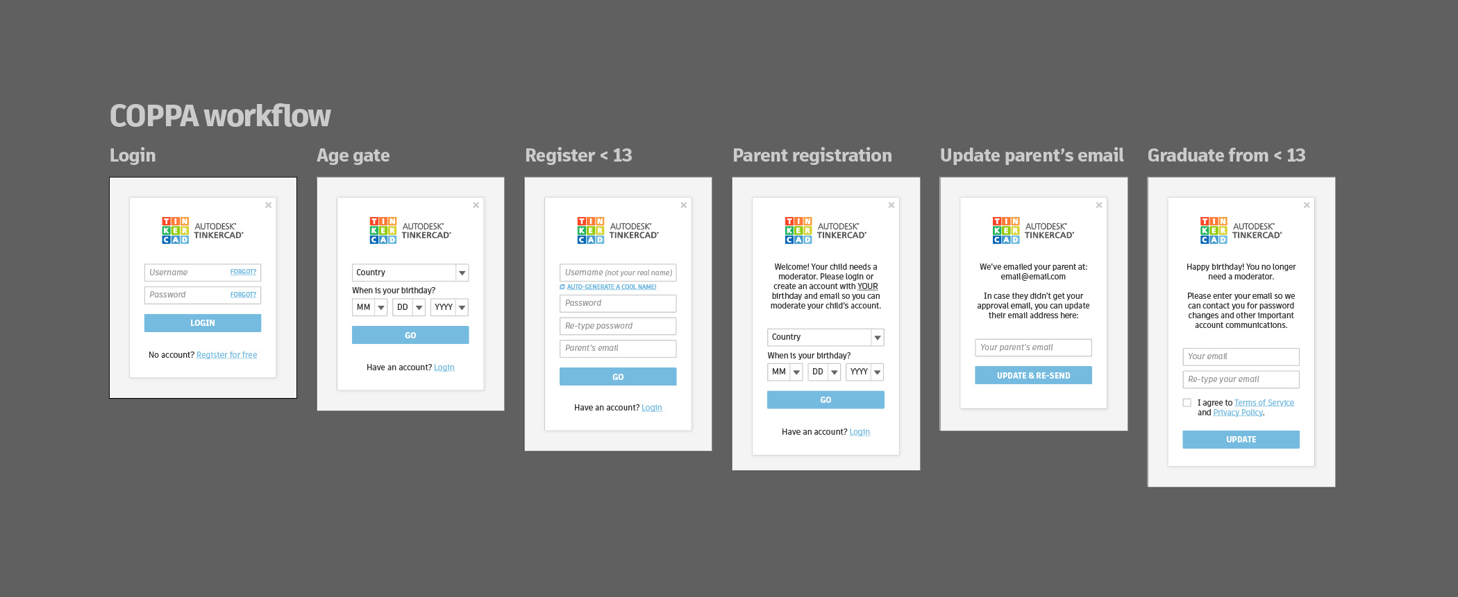
Eventually all of that complexity, as it always does, boiled down to a very simplistic user interface. Question arises – why not design backwards?
Form design
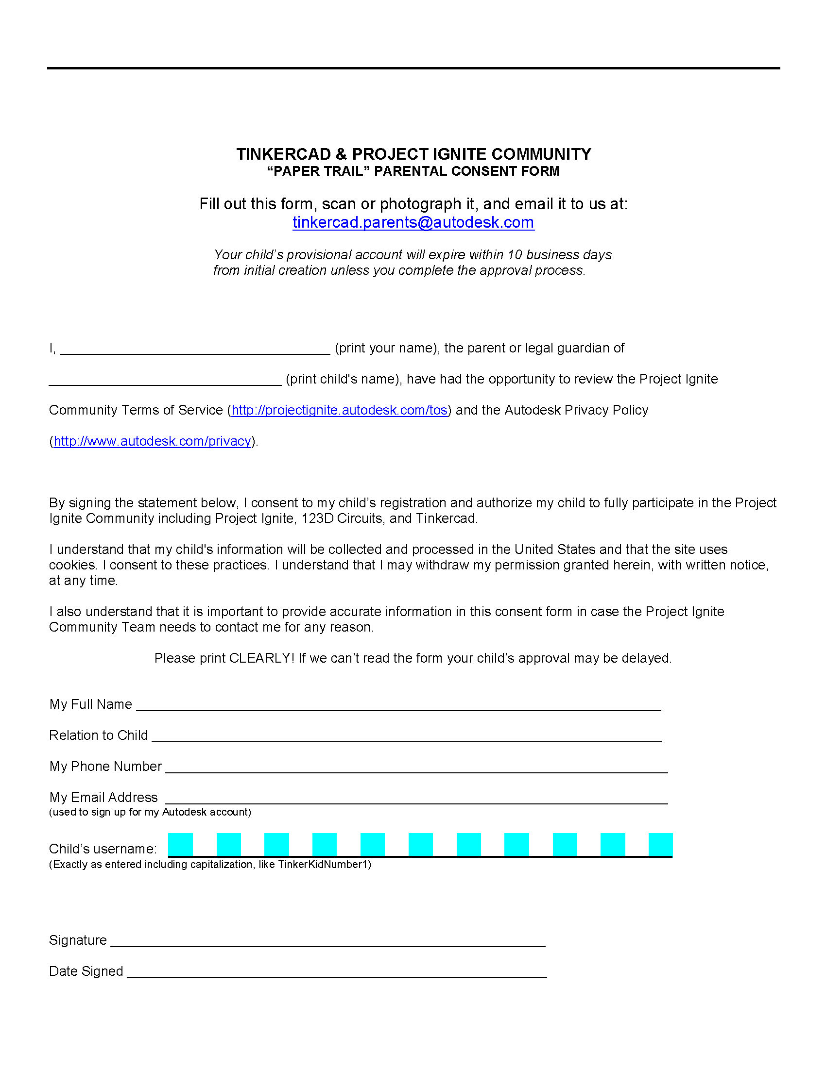
V1
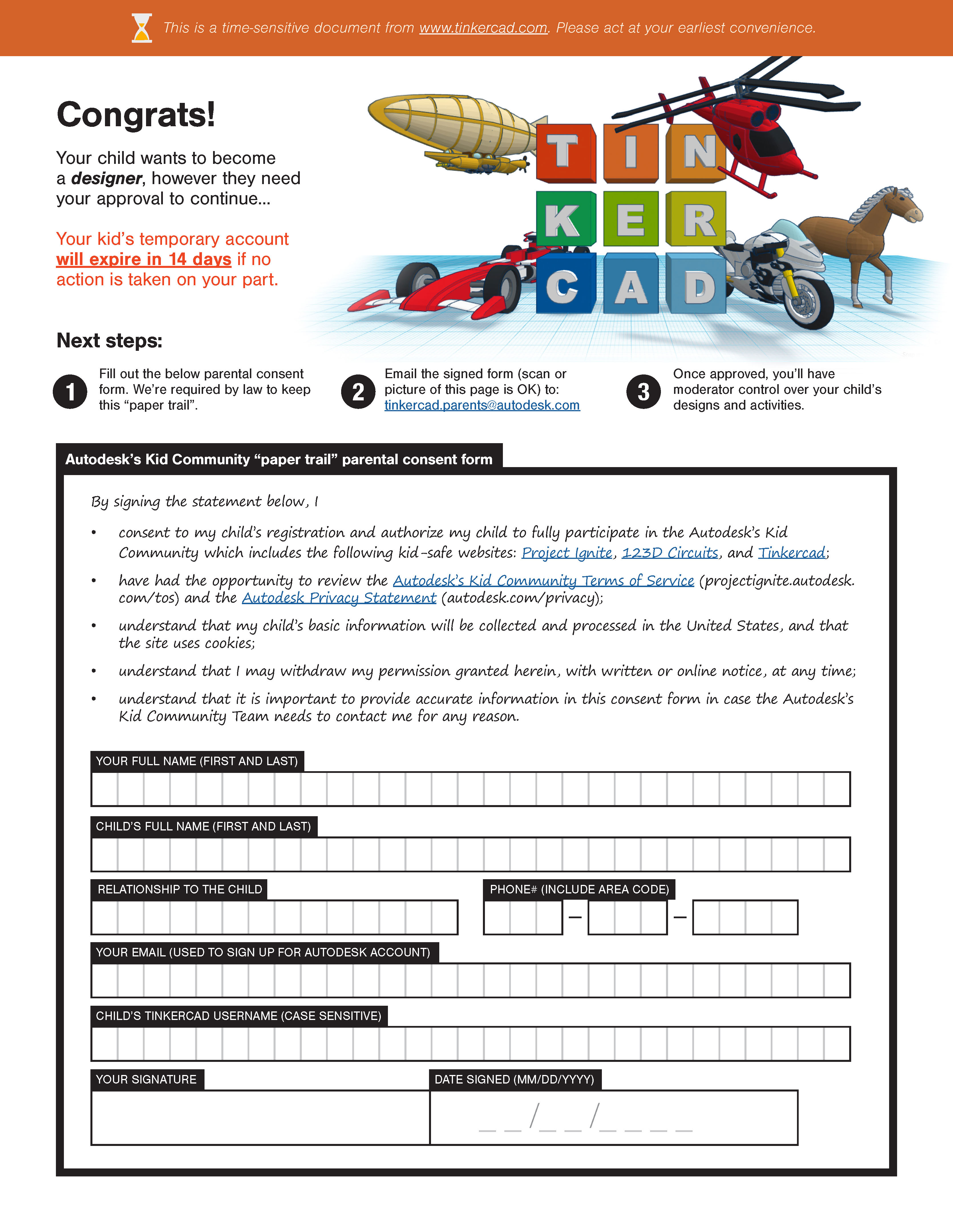
V2

V3
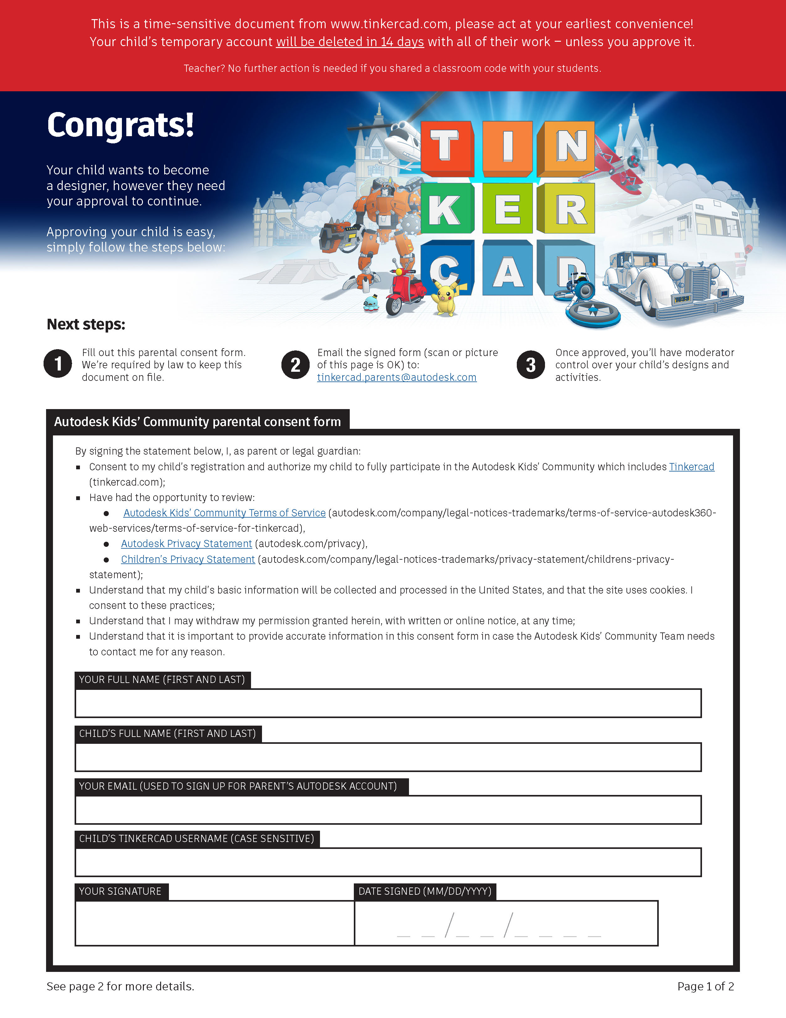
V4
One of the main touchpoints in this workflow was the Parental Consent form – a PDF document that required parent's or legal guardian's signature. This document was to be kept on-file, in case it ever needed to be presented to the inquiring party (like federal government, for example). Here's what it looked like:
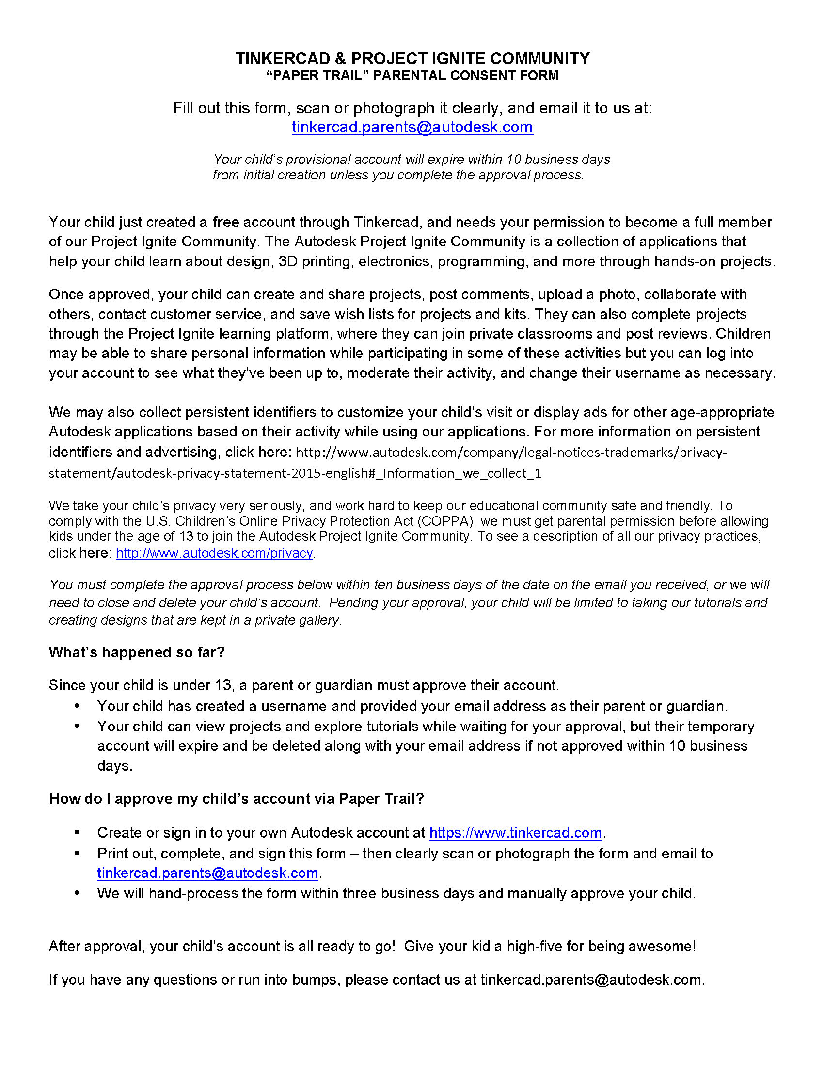

V1 of Tinkercad's Parental Consent form – my starting point.
Here are just a few things that are wrong with “this picture”:
- All we needed was for parents to sign the form, yet the actual form was located on the second page of the PDF file, and many people couldn't find it because of the way Adobe Reader's design (great work, Adobe) – they didn't even know that there was a second page…
- It goes without saying that the initial document had little "architecture" when it came to content architecture. So important information was missed and "unimportant" was read.
- Inconsistent typography undervalued the product in users’ eyes and as a result didn't look professional enough to be fully trusted. This resulted in lower success rate (would you sign such a document and pay a small fee on top? You'd think twice…).
- It was WAYYY too wordy. Definitely looked like someone from legal/business departments put it together. Someone who didn't care much about experience, usability, and human time.
- Whoever wrote this liked to repeat things twice and used diffiult-to-understand language.
- Sometimes people filled out these forms by hand and emailed us back photos of the signed consent form – in some cases it was impossible to read their handwriting.
- Perhaps the funniest part of the form was the username field (with all of those cyan boxes). This was created for legibility – to give users a visual indication of where to put characters, so they would have sufficient spacing and be legible for us to understand… Some people included characters only in those cyan boxes and not in between them…


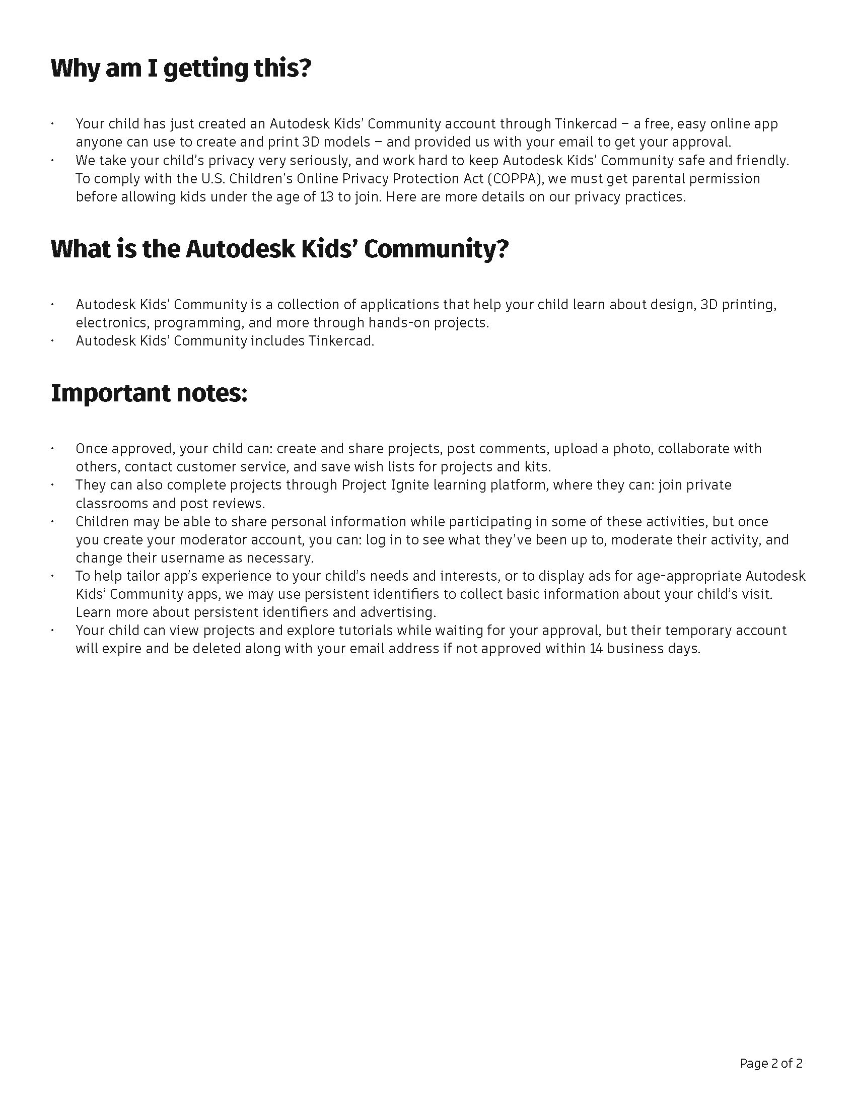
V2 vs V3. “Safest company in the world” award goes to... Autodesk! After all, legal department wanted to make things even safer by adding a second page that mostly repeats the first one (again).
Majority of designers would have simply redesigned the form fields on the second page to "clean things up", and improved consistency in text styling – and for a good reason! But I'm not part of the "majority", and my design process goes a bit deeper than that…
You see, the only way to reverse the order of the form and the legal language, so that the form would be on the first page, was to completely re-write the copy to include the most important points on the same page that the form would be found on. This is exactly what I did. While I'm not an attorney, I do exercise common sense. And it is my belief that the common sense always prevails.
First of all, I found out from the legal department what parts were required – they obviously said "everything"… I dug deeper. I sat down and re-wrote the entire thing by myself – with [un]common sense in mind, eliminating unnecessary repetitions, while turning 'legal speak' into human language.

After

Before
As you can tell, it ended up being so that even the legal department can be incorrect in saying that we need "everything". In the end, unnecessary information such as the phone number and relationship to child ended up being dropped after all…
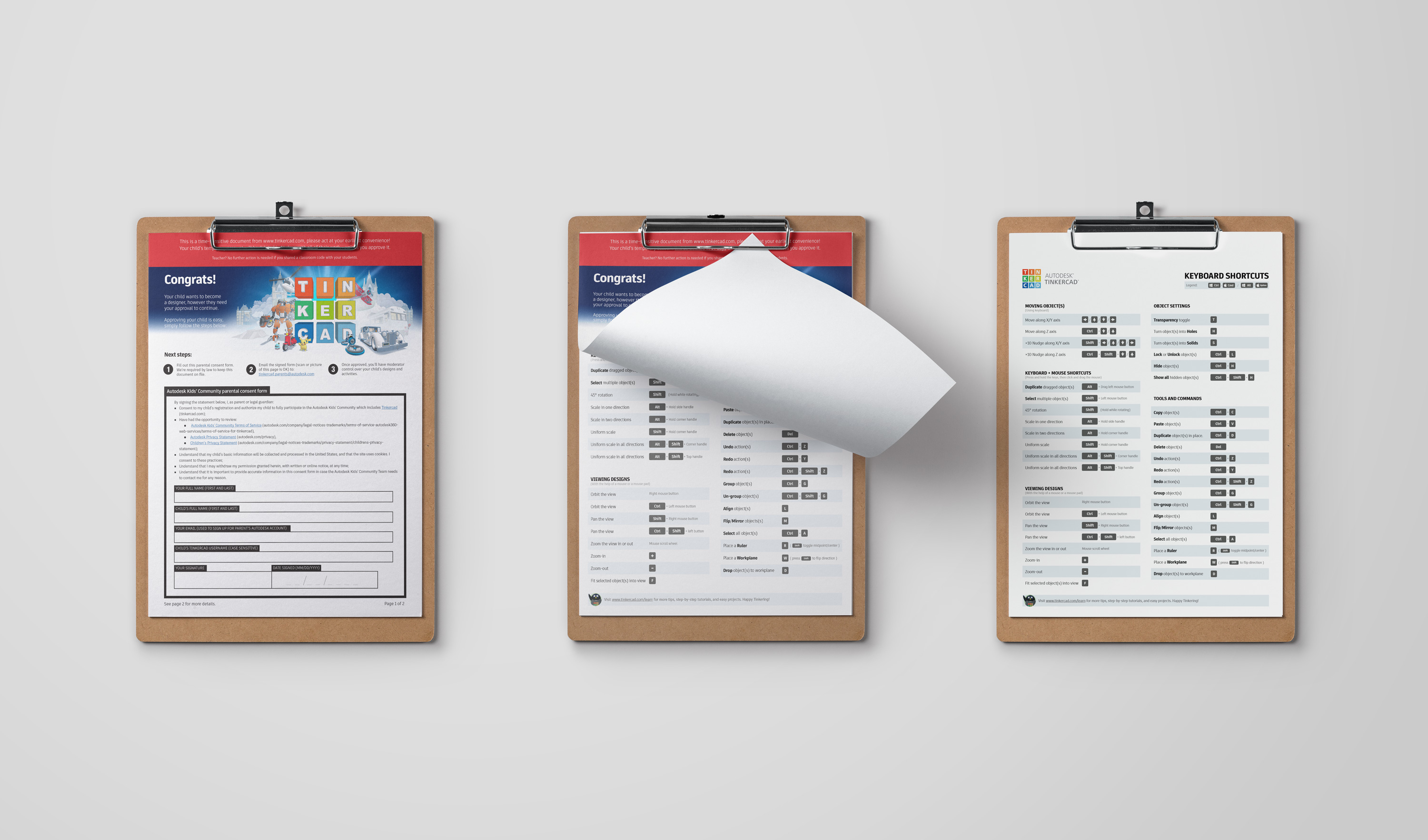
Parental child forms (COPPA) re-designed and re-written from legal perspective to be more concise and more user-friendly + official Tinkercad keyboard shortcuts. I did all the form design and majority of re-writing. Internal corporate lawyers confirmed compliance. Seen here is the Keyboard Shortcuts PDF download which I have also designed.
Content & Marketing
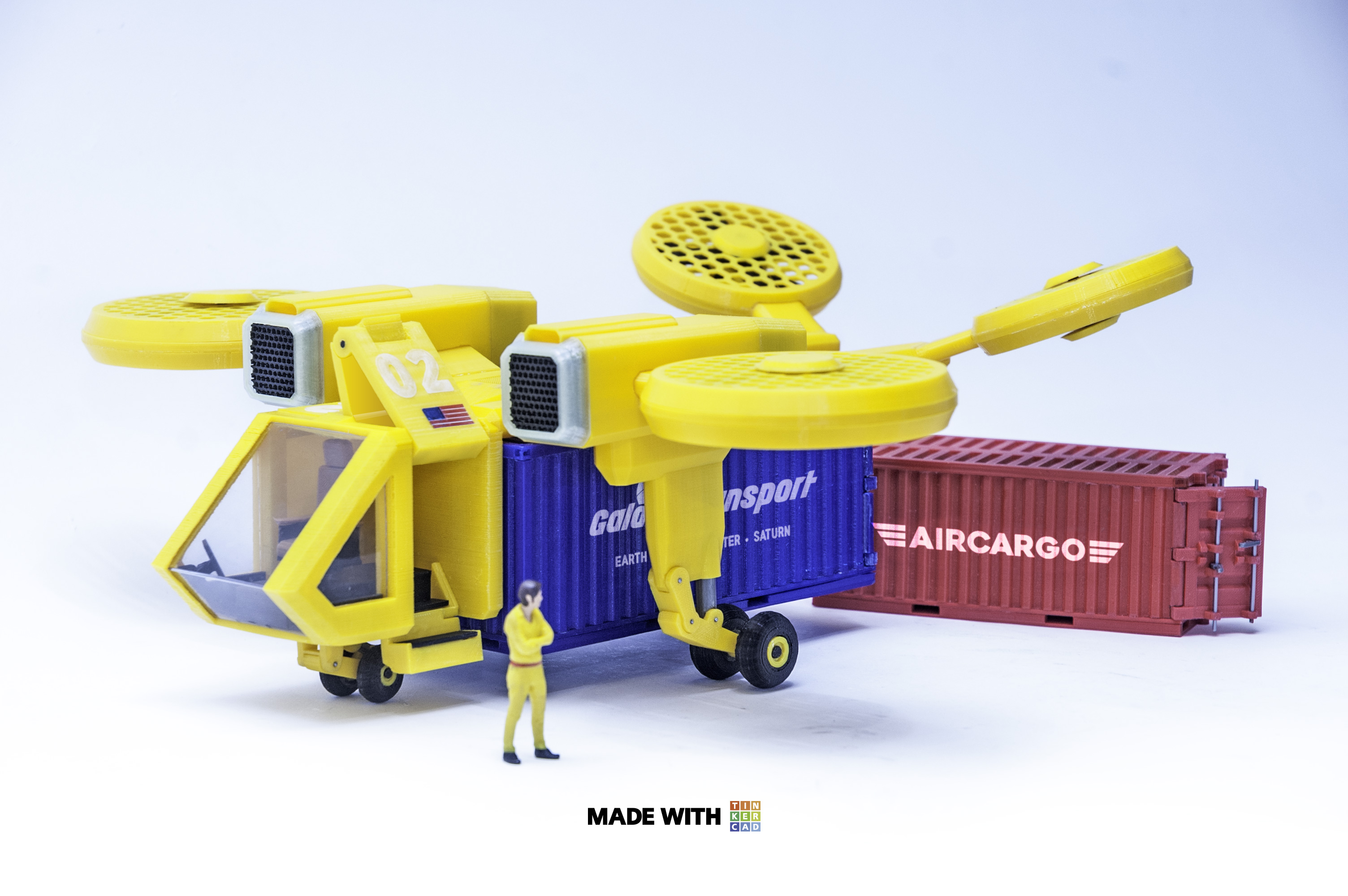
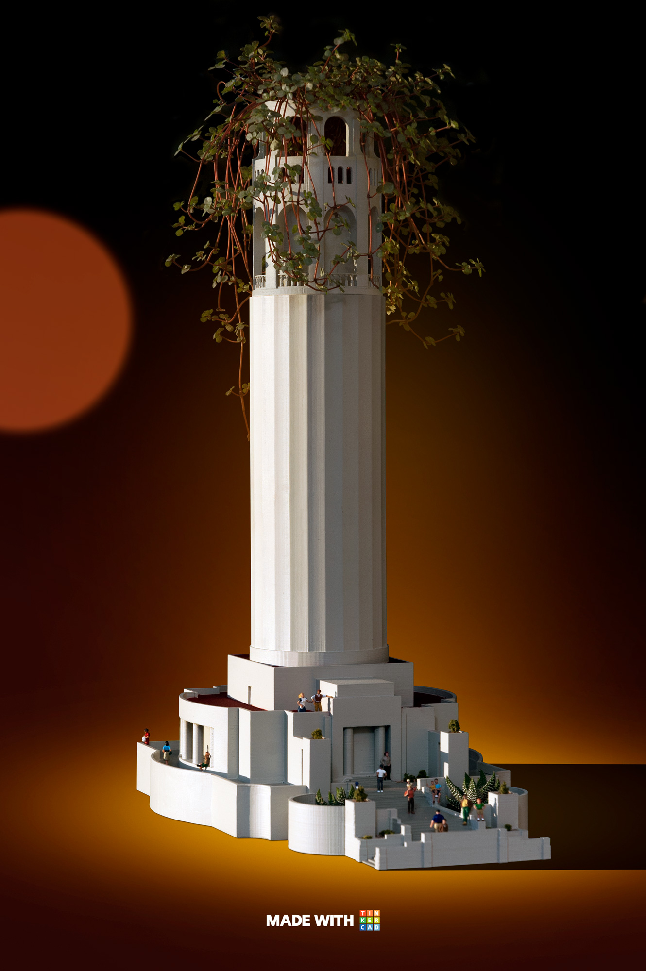
Tinkercad couldn't exist without content. And it certainly wouldn’t be able to grow as fast as it did, had it used mediocre content developed by marketers who are not makers themselves. Needless to say, a lot of promotion involved creation of highest quality content the world of 3D design and 3D printing has ever seen.
Click on any one of the projects for more information…
The main problem laid in that Tinkercad was perceived as an amateur tool, or an app for kids – at best. While that might be the case, it was important to explain to professional users that this happened to be the essential tool in everyones toolbox – including theirs.
With that in mind, I've spun off numerous projects showcasing much more intricate and purposeful designs. Something that would – at its core – be simplistic and easy to understand, yet at the same time hint at the fact that things can get a lot more detailed, for more complex, real-life applications.
While developing all this content, I've come to realization that the best way to market this particular product was through the direct use of all of these physical creations.
This is why I recommended to create #MadeWithTinkercad, as it established an important connection to EXACTLY what the user can walk out with, should they choose to sign up (for free). Expectations were set the minute a potential user "set their foot through the door" – something that previous designers and marketers would always try to portray via other graphical styles – most of the time vector illustrations.
Landing pages (aka "Tinkercad for…")
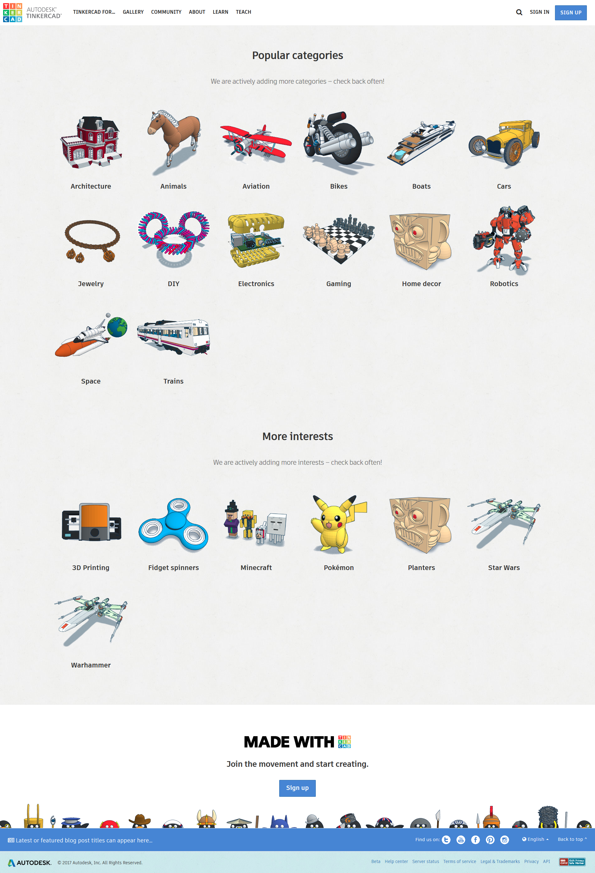
Growing Tinkercad via targeted [and popular] keywords and landing pages was just common sense. …Up to this day I still can't quite figure out why on earth the internal marketing department chose to "sit" on majority of these landing pages that I have build out with the help of Dina and Maya instead of releasing them so the product could grow exponentially. Strange decisions all-around…

Fidget Spinners in collaboration with Maya Thomas
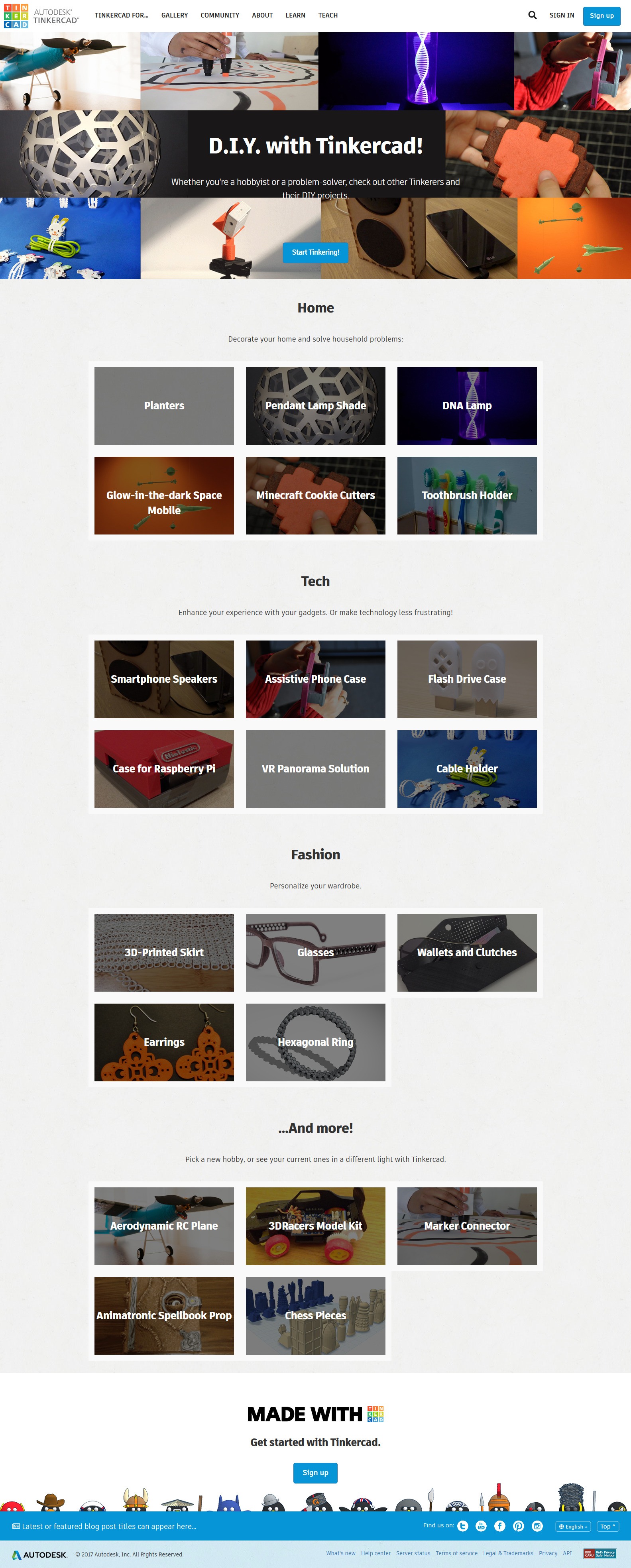
DIY section in collaboration with Dina Bseiso

Minecraft
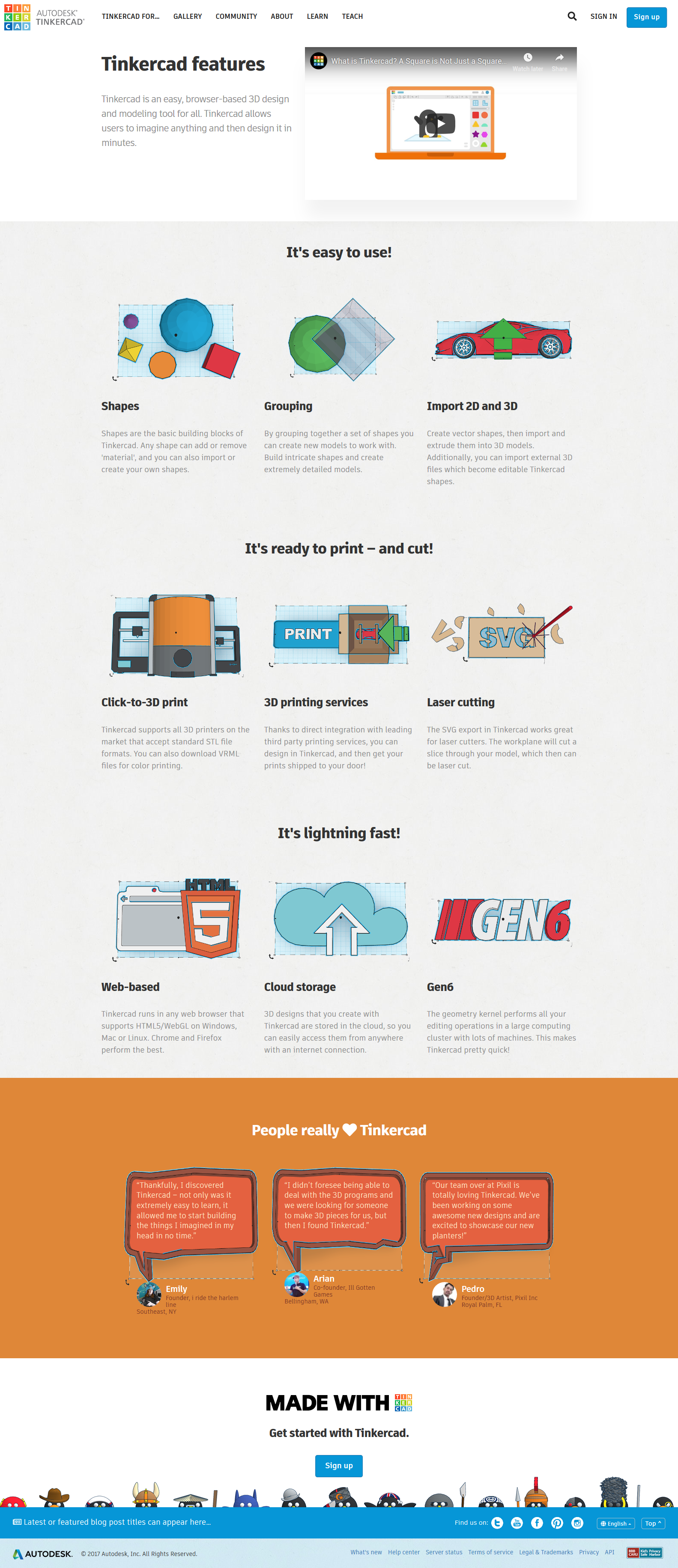
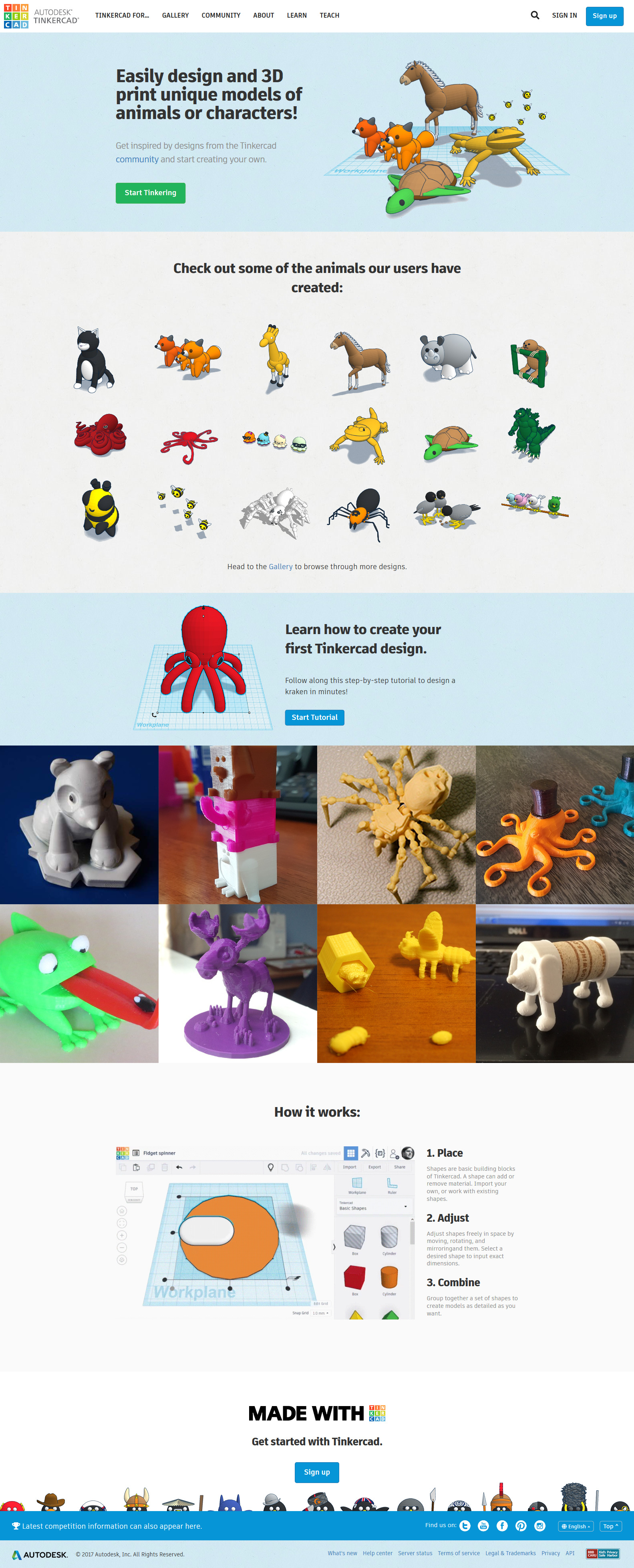
Animals in collaboration with Maya Thomas
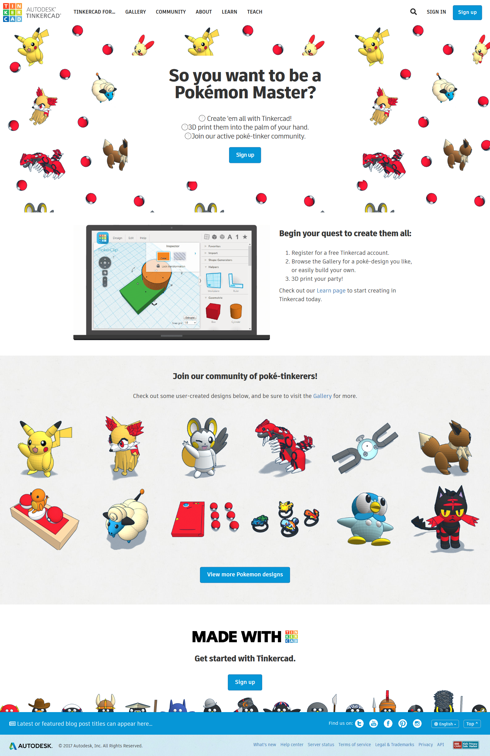
Jumping on the PokemonGo bandwagon: collaboration with Maya Thomas
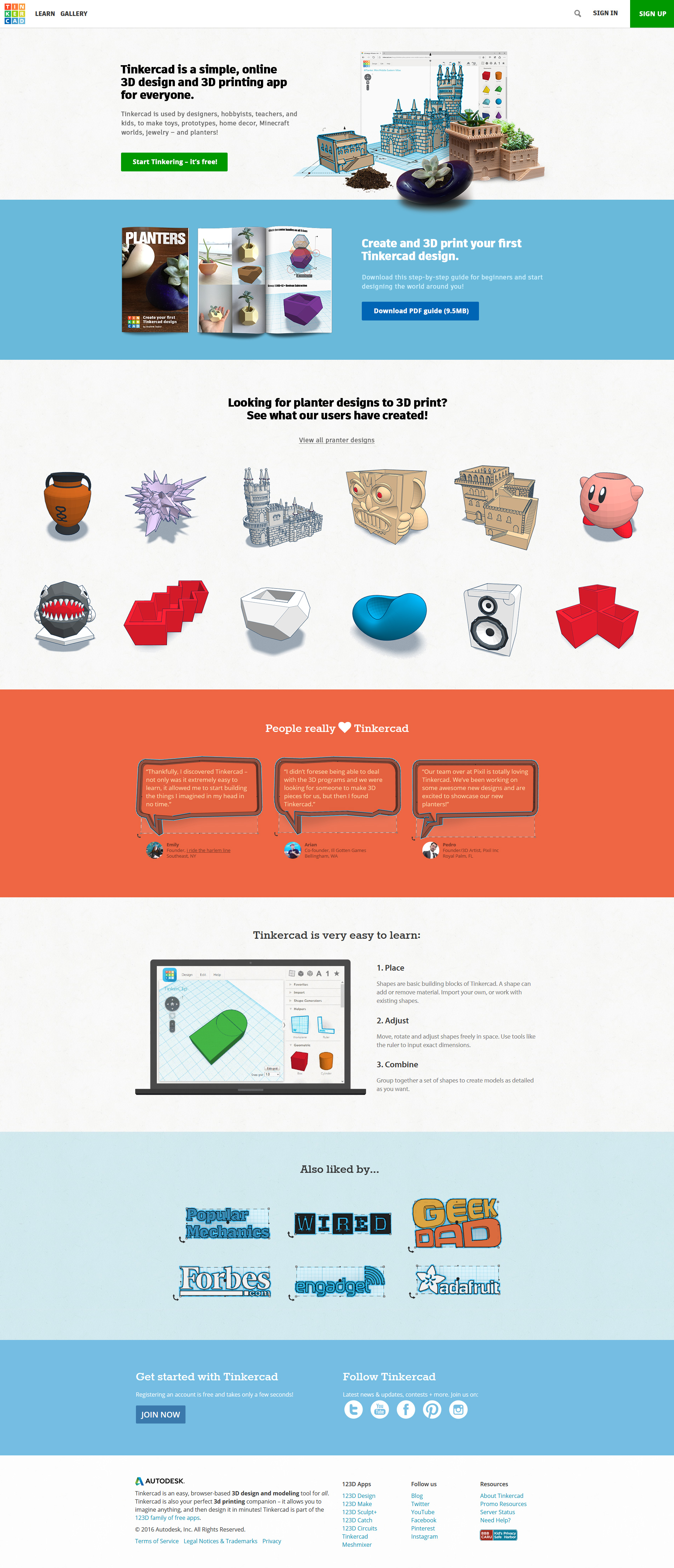
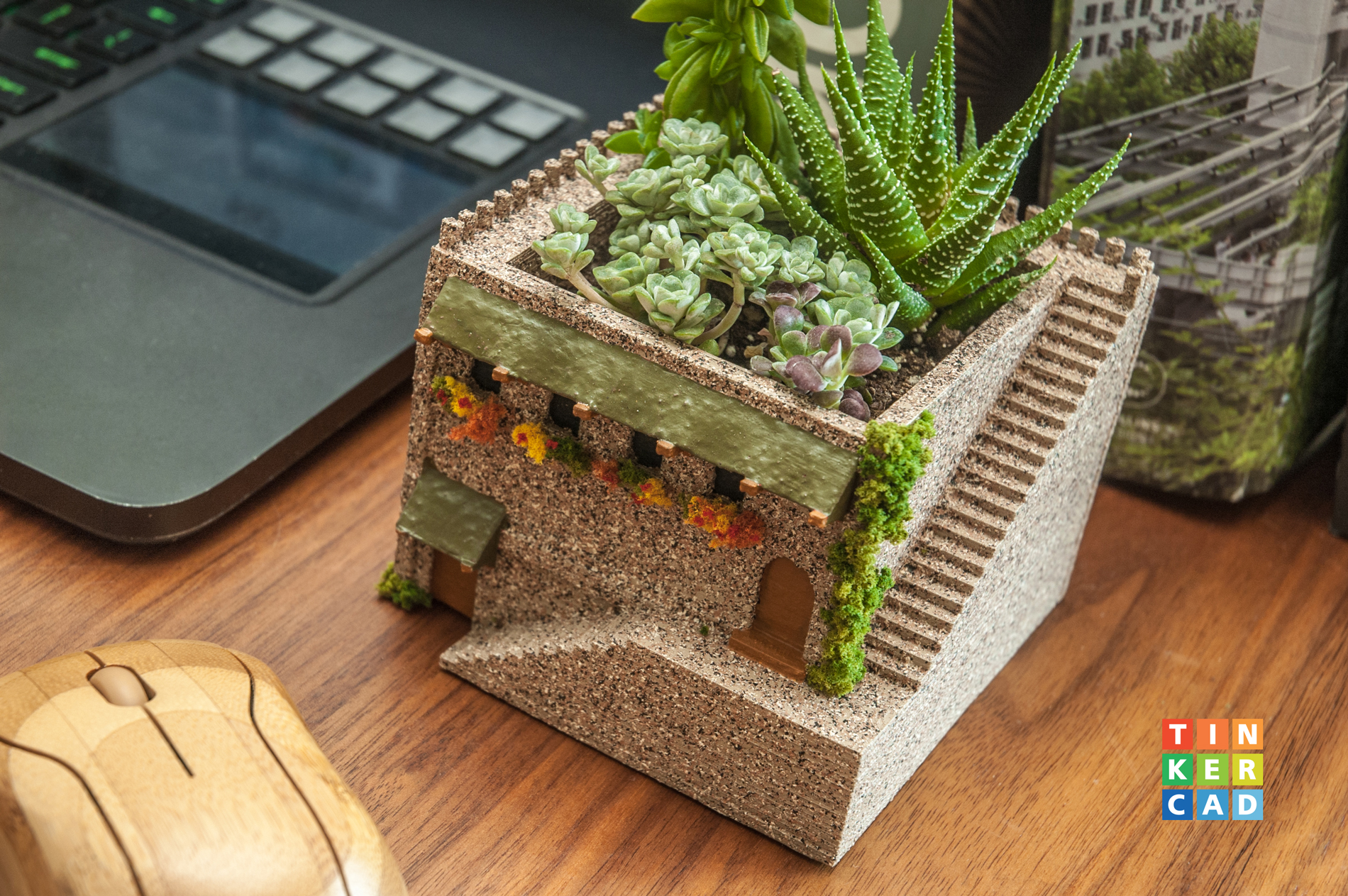
Planters in collaboration with Andrew Taylor
Just to give you an idea, here's what a partial sitemap ended up looking like for all the responsive templates that I have personally coded from the ground up.
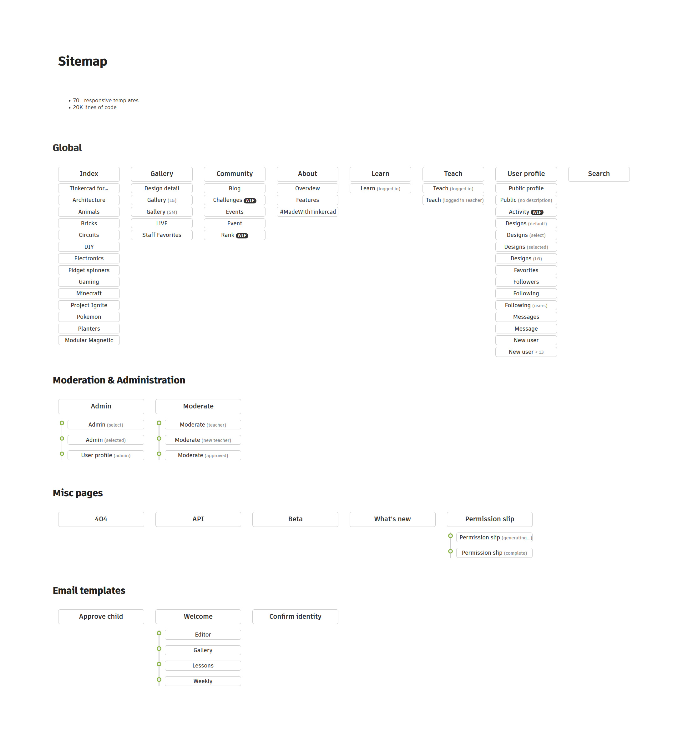
70+ responsive templates; 20K lines of code
Testing & Optimization
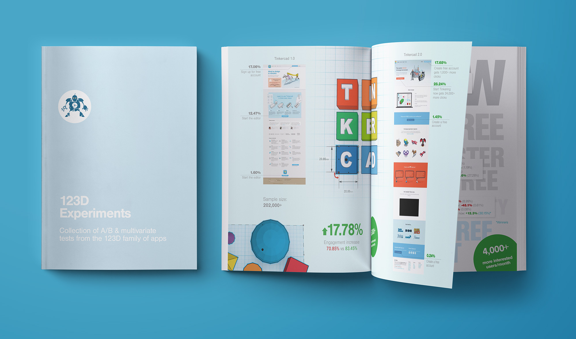
Coming to this style was no accident. After jumping on this project, I've collected all the benchmarks from top landing pages and, working alongside the amazing Amy Phillips, put out the initial revision - iteration B. The redesign was so well received by the public that it DOUBLED an already insanely high conversion rate. this was the beginning of Tinkercad's climb from thousands and hundreds of thousands of users, to MILLIONS in a matter of a year. Recently website surpassed 20 million registered users!
Redesigns were purposeful and always backed by real data. V2.1 design took into account things like organic SEO, main CTA's above the fold, confidence reinforces such as the reassurance of the product being free (which was closely positioned to the main CTA on purpose), clever use of GIF animations to show the simplicity and the ease of use of the app, and nominal amount of cleverly written copy.
In my 15+ years in this business, I haven't come across a higher converting website. Truly incredible.
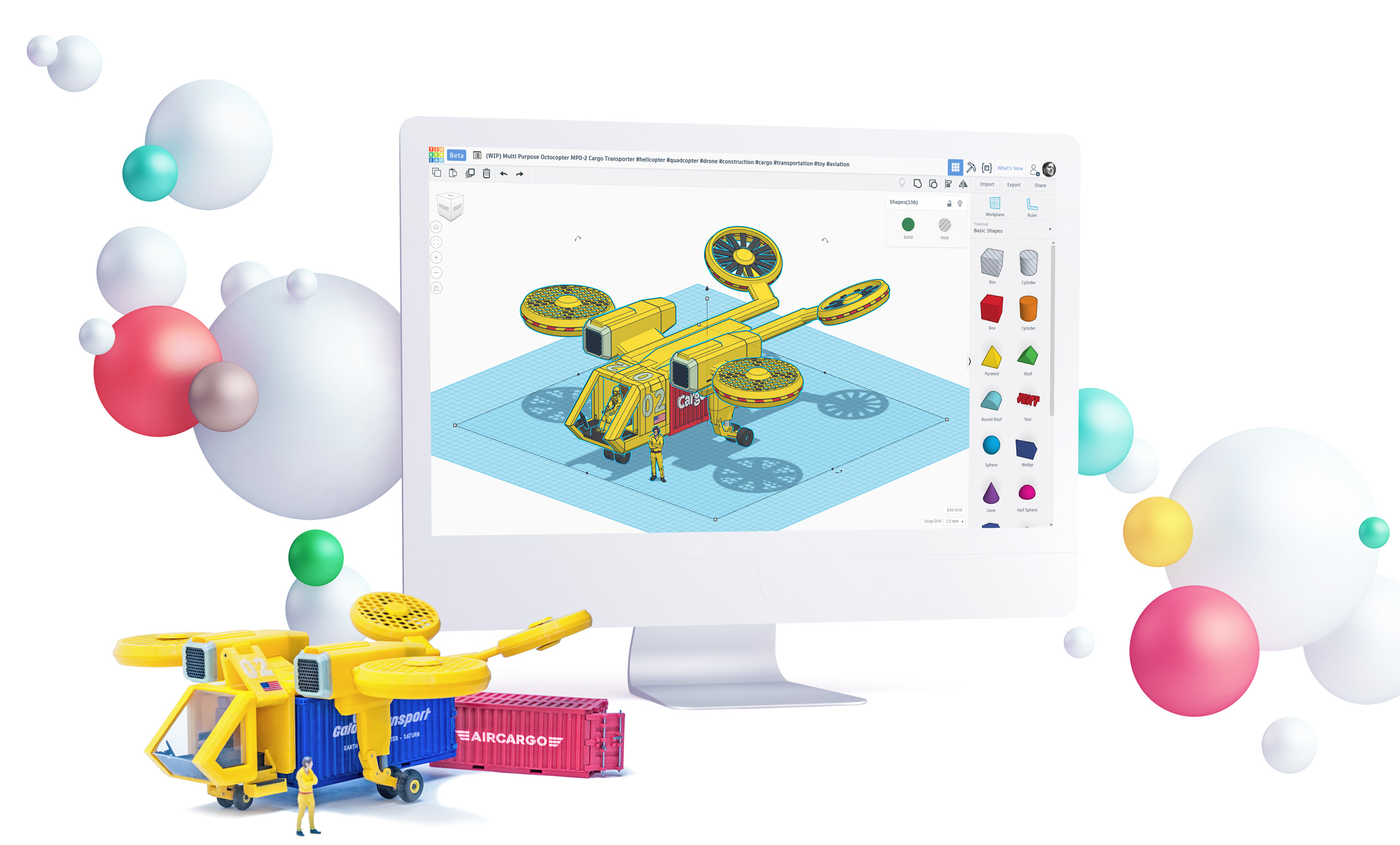
App redesign
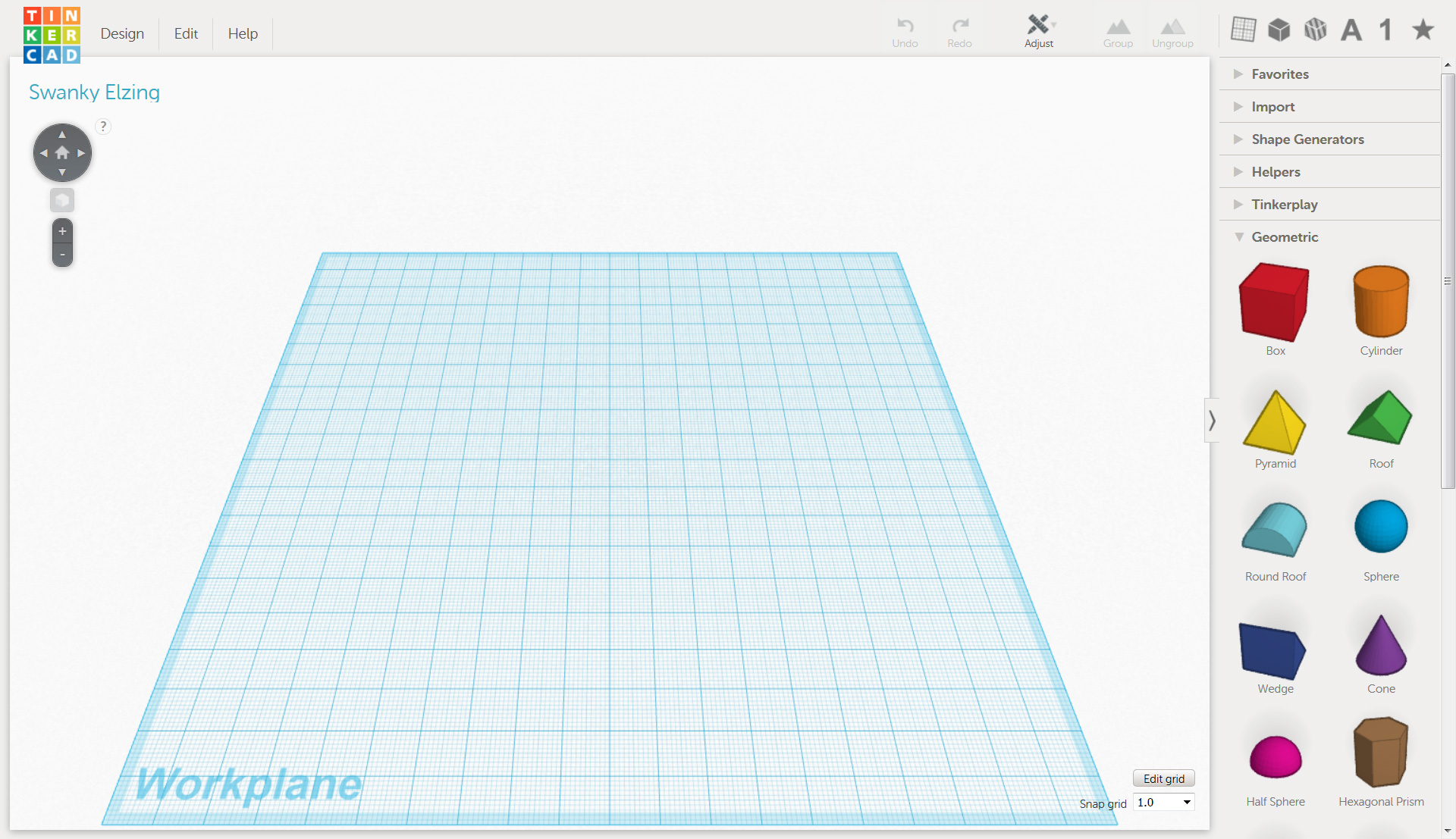
V1
V2
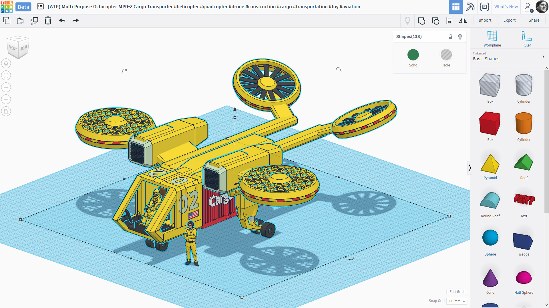
V3
V1
If it was up to me, I wouldn't have done any drastic UI changes to the app itself, as it was already pretty perfect. Perhaps I would fix a few small UX annoyances, but for the most part, the app "just worked". And when something isn't broken, don't "fix it" – instead put in extra effort into perfecting and growing community, which, in Tinkercad's case could use A LOT…

V1.5
…As community grew, so did the app. It all started with small, incremental changes. Seen here is one of such UI changes. Right hand side panel used a tabbing mechanism to uncover tools and sections; to get to these you could either click on the row of icons at the top, or expand each one of the section titles by clicking on them – both accomplished the same task, which I always found to be redundant.
My biggest gripe with this panel, however, wasn't in how it was interacted with, but the type of content it contained, overwhelming majority of which were shapes, not features or tools. So the reason as to why previous product owners/designers decided to wedge in a concept of "Helpers" into this panel is frankly speaking beyond me.
Helpers, at least to me, are just tools. Like the group/ungroup, delete, duplicate, etc. Why on earth mix them up with shapes??? As a result these two orphans never got much love since not many browsed through these categories outside of the basic shapes. So it was decided to make this section expanded by default. This obviously shifted down the entire basic shapes section, giving it even less viewing area – great!

V2
…There was a time when Autodesk was in the "alignment" stage, as in they wanted to align all of their products to look and function the same; we're talking a HUGE company-wide adoption. In charge of this initiative from the consumer side two people from the Circuits team were selected to reenvision the interface:

- As a result, the simple, and single top navigation bar doubled in size. This begged a question: if we were able to achieve the same with a single bar, why double it in size? Not only did this increase header's height, taking away from really valuable screen real estate, but this move also forced them to make all the buttons and their hit areas drastically smaller in size.
- Thankfully the side panel received some much needed improvements that included the removal of categories. The downside? These were replaced by a very annoying UX of a dropdown menu. One click turned into two, and sometimes [on smaller screens] into three.
- One of my biggest pet peeves was the default Tinkercad naming generation. Each time a user would create a design, the app would auto-generate a "funky name". So instead of millions of pages with indexable keywords, you'd get millions of pages filled with gibberish nonsense: "Funky Tatakuku", "Enormous Jive", "Fiddely Flipperson", and so on. Users would still have to go through the process of changing the name, which, again, begged the question: why not get them to do it each and every time a new design was created?
- Previous design listed the name at the top by default, it was part of the canvas and didn't take away from valuable screen real estate; this wasn't the case in this iteration. Now every screen would be anchored to the very ugly and the very prominent name each and every time. Do you really need this to be the most prominent part? I don't think so.
V3

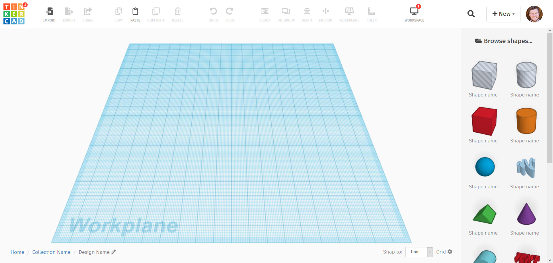
- It was my job to keep the community in alignment with the app majority of the time. However in this case, I felt that the app needed to reflect the design of community. As such, I've taken things back to square one by eliminating the two story header.
- One of the most frequent user requests after the redesign was the lack of descriptions underneath each one of the tools, this was done as a compromise since we were already taking away screen real estate by doubling up the header. I've gone ahead and brought descriptions back.
- Being a user myself (I don't involve myself with projects that I feel I am unable to contribute to) I knew all the pain-points firsthand. And the limited space for shape discovery was always an issue. As such, I've freed up as much screen real estate for shapes as I possibly could by removing any and all functionality from the side panel which didn't deal with shape selection.
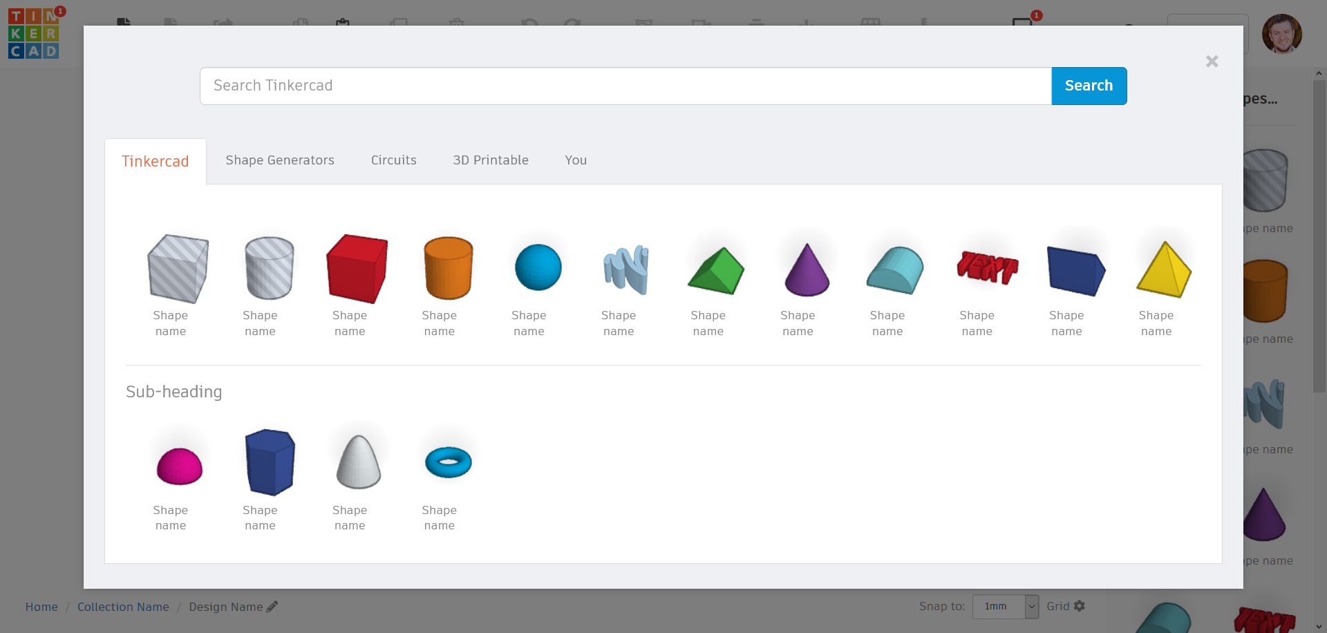
- Since there were already extra click(s) added to the shape selection process, I at least wanted to improve the browsing experience… I opted to go with a modal browser that would allow for maximum area of the screen to be filled with shape browser. Previously unavailable, and highly requested functionality of searching for shapes was also added as an anchoring element in the said modal design. This allowed for user to see all the shapes without doing [in most cases] any scrolling or clicking.
- Impot, Export, and Share, for some reason were redesigned to look completely different from the rest of the tools, and on top of it, they were positioned last on the list. I wanted sharing to become a lot more promonent, and since you could really begin your workflow by importing something, I moved all of these features to the front as a result.
- Another reason as to why the rpevious iteration grew from single to double header was due to introduction of user information, as well as new workspaces: Bricks, Electronics, and Coding. These were all kept visible due to the fear that user would not notice them should they be presented any differently. Three extra items already felt quite "heavy", especially for users who never used them. I have opted to join them all into a single button called "Workspaces" which would envoke a dropdown; to let users know of any new additions to this feature, a simple red notification dot would show up – an already familiar-to-the-user pattern which was brought over from the "community"/website. If anything, this became even more prominent as the previous complexity of multiple icons and their graphical styles was making the user completely miss these elements subconciously (you brain ignores complexity, in case you weren't aware).
- At last, Ruler (which to this day I still don't know how to use due to its extreme complexity) and workplane functions were brought alongside of the rest of features, giving them all equal weight.
- The unimportant name of the design was greatly downgraded in its proninence by moving it to the bottom left.
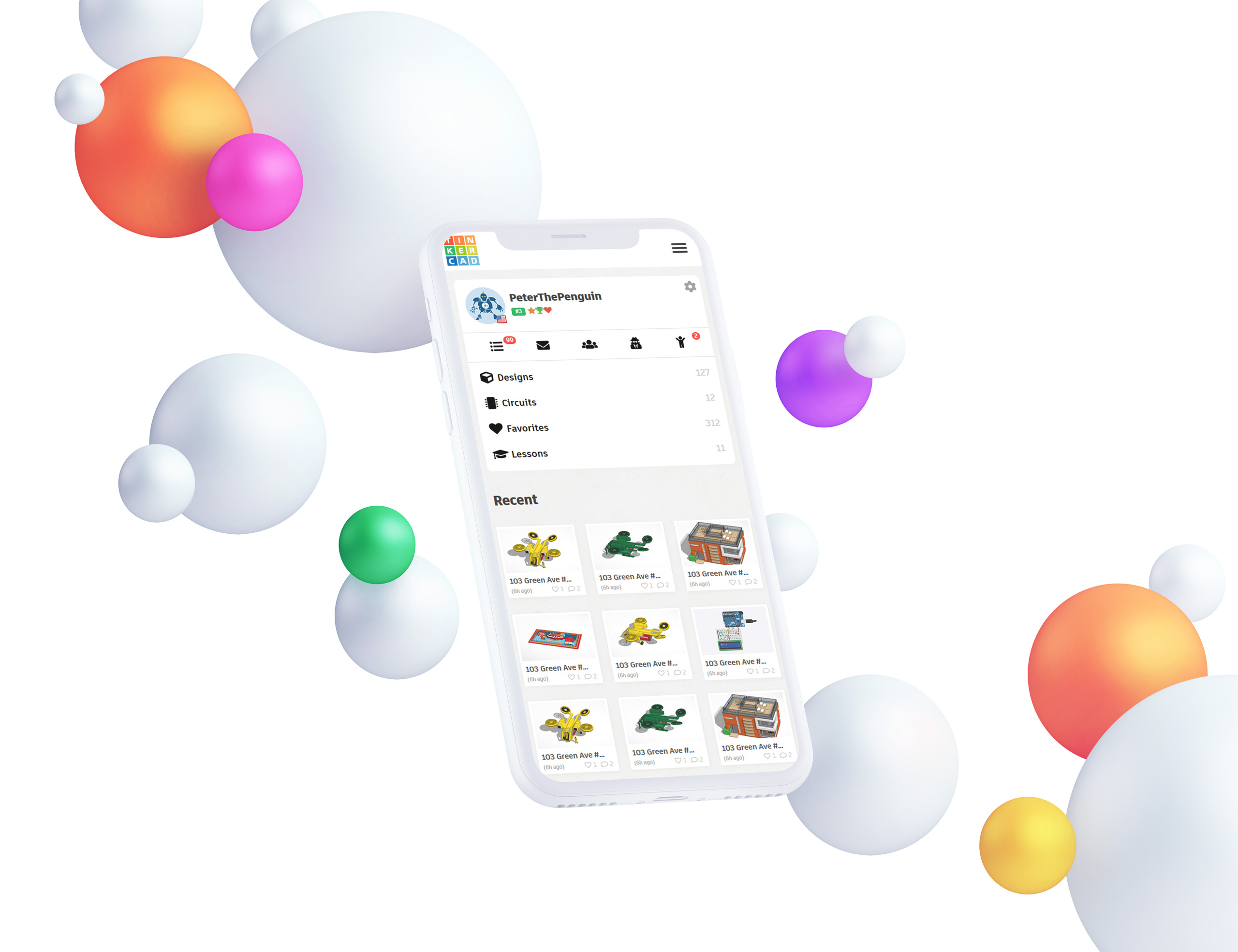
Mobile experience
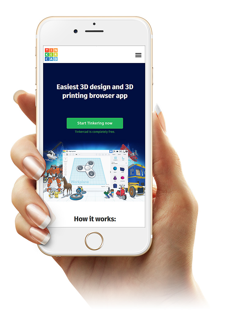
While growing the initial consumer offering for Autodesk (123D apps) I've suggested we – as a team – standardize on the front-end framework. For this reason I've selected Bootstrap as a starting point for everything we put out.
Reasons for using Bootstrap vs something homegrown are quite obvious, but the biggest ones were documentation and community. The same reason why I always rooted for move to Drupal (that never really ended up happening unfortunately…)
Enjoyed what you saw? Stay updated by following me.
